The weather in Philly the past week has been just gross. It reminds of Florida in that it has been hot, steamy, storms and downpours pop up out of nowhere then disappear, and just, generally, gross. I do not understand how people live in Florida year round. Anyway, that got me thinking about this piece from a month ago in the New York Times. It looked at the impact of climate change and living conditions in South Asia. Why is South Asia important? Well, it is home to nearly a billion people, a large number of whom are poor and demanding resources, and oh yeah, has a few countries that have fought several wars against each other and are armed with nuclear weapons. South Asia is important.
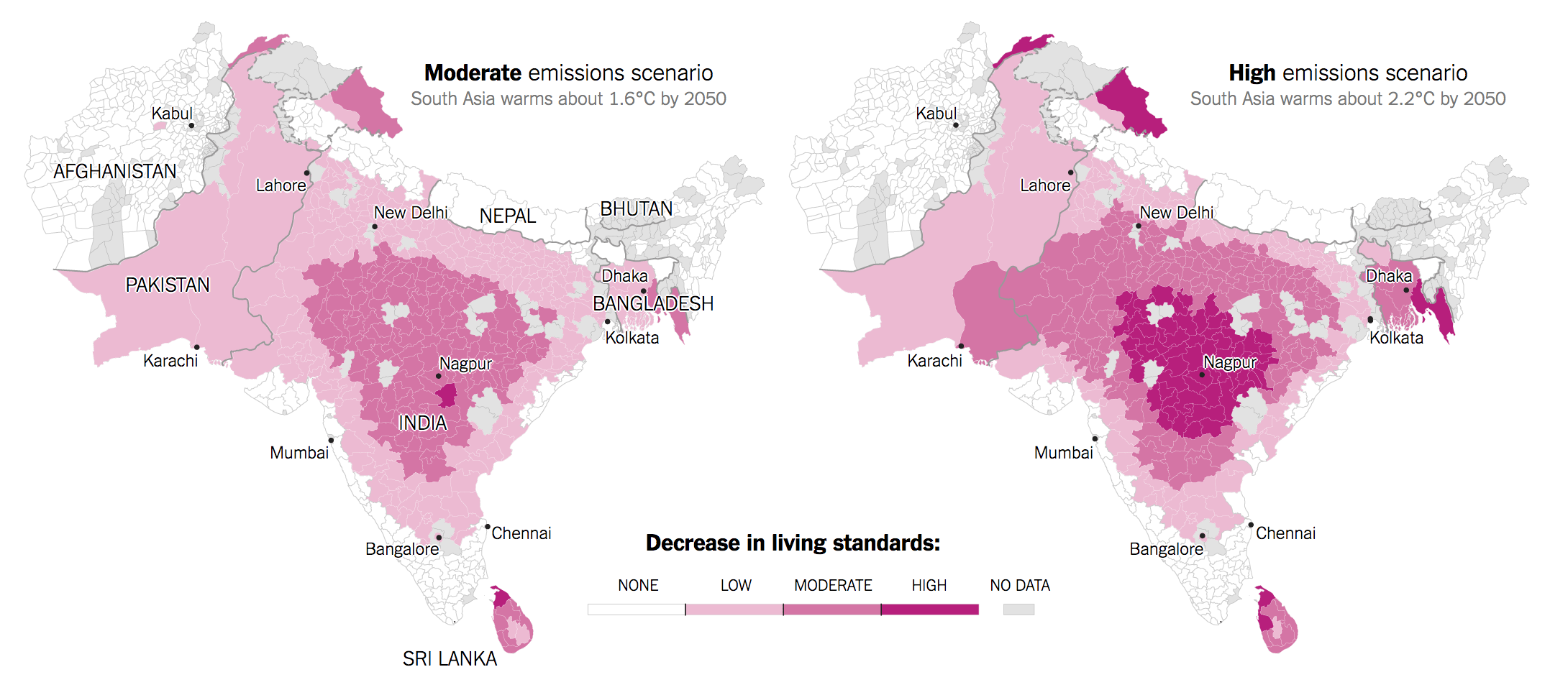
The map from the piece—it also features a nice set of small multiples of rising temperatures in six countries—shows starkly how moderate emissions and the high projection of emissions will impact the region. Spoiler: not well. It notes how cities like Karachi, for example, will be impacted as hotter temperatures mean lower labour productivity means worse public health means lower standard of living. And it doesn’t take a rocket scientist to see how things like demand for water in desert or arid areas could spark a conflict between Pakistan and India. Although, to be very clear, the article does not go there.
As to the design of the graphic, I wonder about the use of white for no impact and grey for no data. Should they have been reversed? As it is, the use of white for no impact makes the regions of impact, most notably central India, stand out all the more clearly. But it then also highlights the regions of no data.
Credit for the piece goes to Somini Sengupta and Nadja Popovich.
Leave a Reply
You must be logged in to post a comment.