Voting is not compulsory in the United States. Consequently a big part of the strategy for winning is increasing your voters’ turnout and decreasing that of your opponent. In other words, demotivate your opponent’s supporters whilst simultaneously motivating your own base. But what does that baseline turnout map look like? Well, thankfully the Washington Post created a nice article that explores who votes and who does not. And there are some clear geographic patterns.
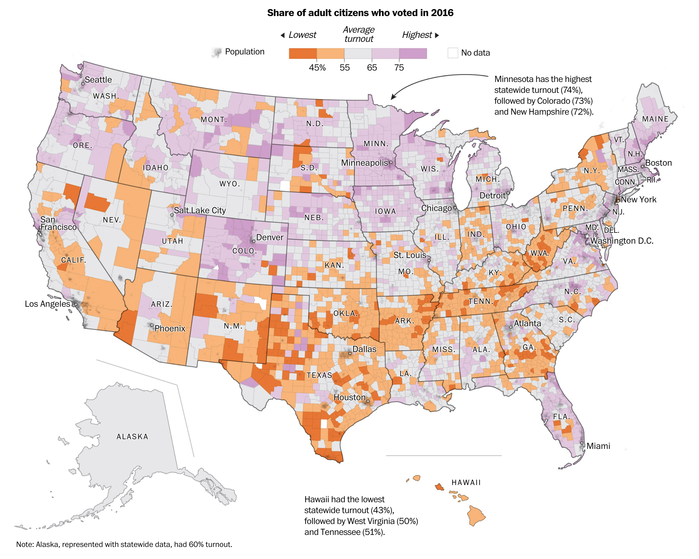
The piece uses this map as the building block for the article. It explores the difference between the big rural counties that dominate the map vs. the small urban counties where there can be hundreds of thousands of voters, a large number of whom do not vote. It uses the actual map to compare states that differ drastically. For example, look at the border between Tennessee and North Carolina. On the Tennessee side you have counties with low turnout abutting North Carolinian counties with high turnout.
And towards the end of the piece, the article reuses a stripped down version of the map. It overlays congressional districts that will likely be competitive and then has the counties within that feature low turnout highlighted.
Overall the piece uses just this one map to walk the reader through the geography of voting. It’s really well done.
Credit for the piece goes to Ted Mellnik, Lauren Tierney and Kevin Uhrmacher.
Leave a Reply
You must be logged in to post a comment.