Christmas time is a time when people receive gifts. Well this year was no different and I received a few. One, however, was in a box stuffed with old newspaper pages. And it turns out one of said pages had a graphic on it. So let us spend today looking at this little blast from the past.
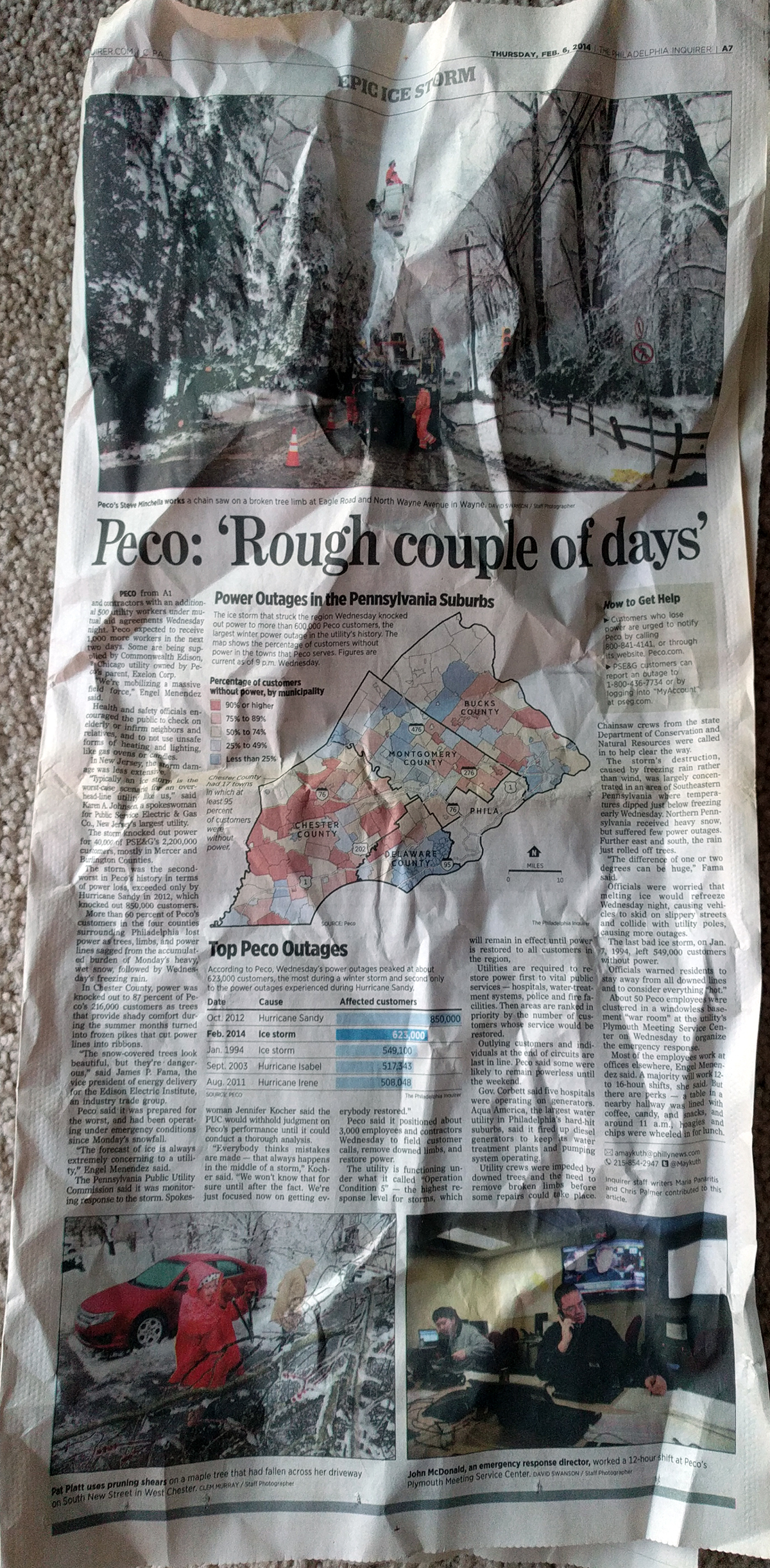
The piece looks at PECO outages, PECO being the Philadelphia region’s main electricity supplier. The article is full page and is both headed and footed with photography, the graphic in which we are interested sits centre stage in the middle of the page.
Overall the graphic is fairly compact and works well at showing the distribution of the outages, which the bar chart below the choropleth shows was historically significant. (Despite my years in Chicago, I was somehow in the area for all but the storm written about and can confirm that they were, in fact, disruptive.)
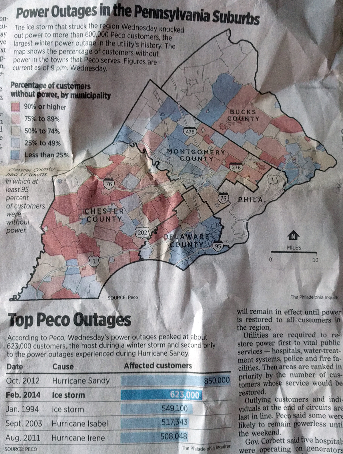
The choropleth works, but I question the colour scheme. The bins diverge at about 50%, which to my knowledge marks no special boundary other than “half”. If that yellow bin represented, say, the average number of outages per storm or the acceptable number of outages per storm, sure, I could buy it. Otherwise, this is really just degrees of severity along one particular axis. I would have either kept the bins all red or all blue and proceeded from a light of either to a dark of either.
I probably would have also dropped Philadelphia entirely from the map, but I can understand how it may be important to geographically anchor readers in the most populous county to orientate themselves to a story about suburbia.
Lastly, I have one data question. With power lines down during an ice storm, I would be curious to see less of the important roadways as the map depicts and other variables. What about things like average temperature during the storm? Was the more urban and built-up Delaware County less susceptible because of an urban heat bubble preventing water from freezing? Or what about trees? Does the impact in the more rural areas have anything to do with increasing numbers of trees as one heads away from the city?
Those last data questions were definitely out of scope for the graphic, but I nevertheless remain curious. But then again, this piece is almost five years old. Just a look at how some graphical forms remain in use because of their solid ability to communicate data. Long live the bar chart. Long live the choropleth.
Credit for the piece goes to the Philadelphia Inquirer graphics department.
Leave a Reply
You must be logged in to post a comment.