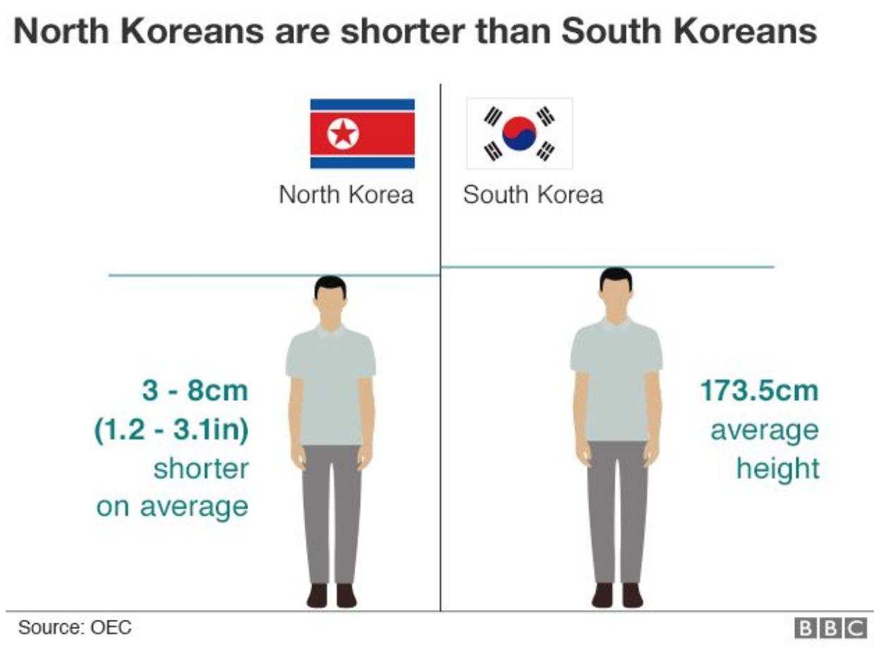
This piece from the BBC is a few years old, but it provides some interesting nuggets about North Korea. Unsurprisingly it appeared on my radar because of the coverage of the Trump–Kim summit in Vietnam. The article says it is nine charts that tell you all you need to know about North Korea. Now, I do not think that is quite true, but it does contain the following graphic—I hesitate to call it a chart—that illustrates one of my favourite details.

The two figures illustrate the average height of a person from North Korea and then South Korea. What do you see? That the North Korean is shorter. This is despite the fact that the populations were the same just a few decades ago. The impact of years of malnutrition, undernourishment, and general lack of well-being have manifested themselves in the physical reduction of size of human beings compared to their nearly identical population to the south.
Thankfully the rest of the piece contains data on things like GDP, birth rates, and life expectancy. So there are some things in there that one should know about North Korea. As much as I find the story of height interesting, I struggle to think it is one of the nine things you should really know about the state.
Credit for the piece goes to Mark Bryson, Gerry Fletcher, and Prina Shah.
Leave a Reply
You must be logged in to post a comment.