Yesterday we looked at a nice piece from the BBC showing how big cities across the world will warm from the impact of climate change. It did a really nice job of showcasing the numbers. But it was admittedly number heavy. (And for the Americans in my audience, you probably were left out in the…cold…because the rest of the world uses Celsius to talk temperature.)
But this piece from the University of Maryland is something I have been raving about for weeks now. Generally speaking, people are able to better internalise data and information when they can compare it to something tangible or familiar. And degrees of Celsius, whilst accurate, fail to do that. So this piece takes their 2080 forecast and compares it to today, but in terms of place.
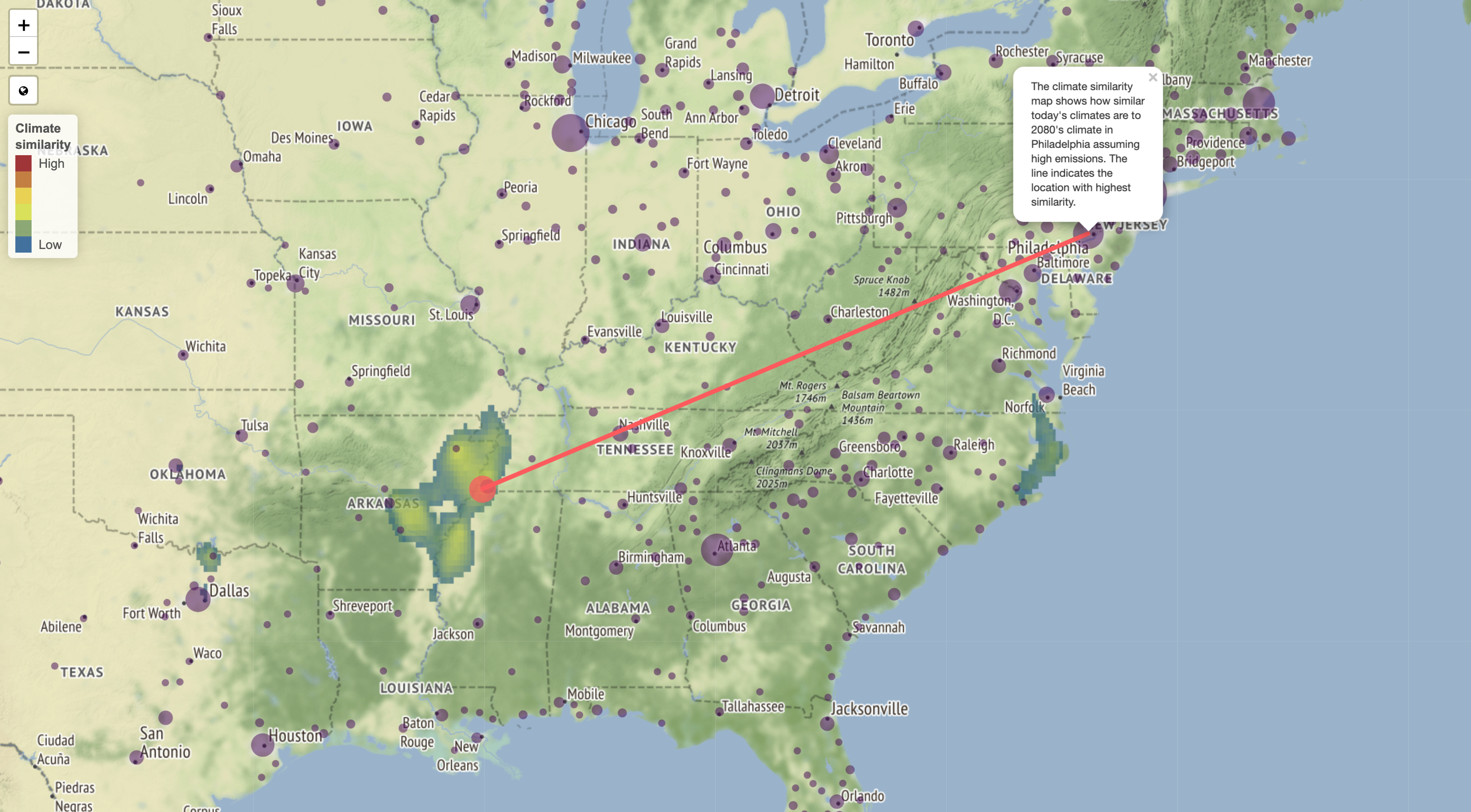
The above map is for Philadelphia. It shows how by 2080, according to a current emissions model, the city’s climate will best resemble that of Memphis, Tennessee and the lower Mississippi River Valley. Or, similar to the tidal regions of North Carolina. Having been to Memphis in the summer once, none of those are pleasant comparisons.
And for those of you in Chicago, it does not get a whole lot better.
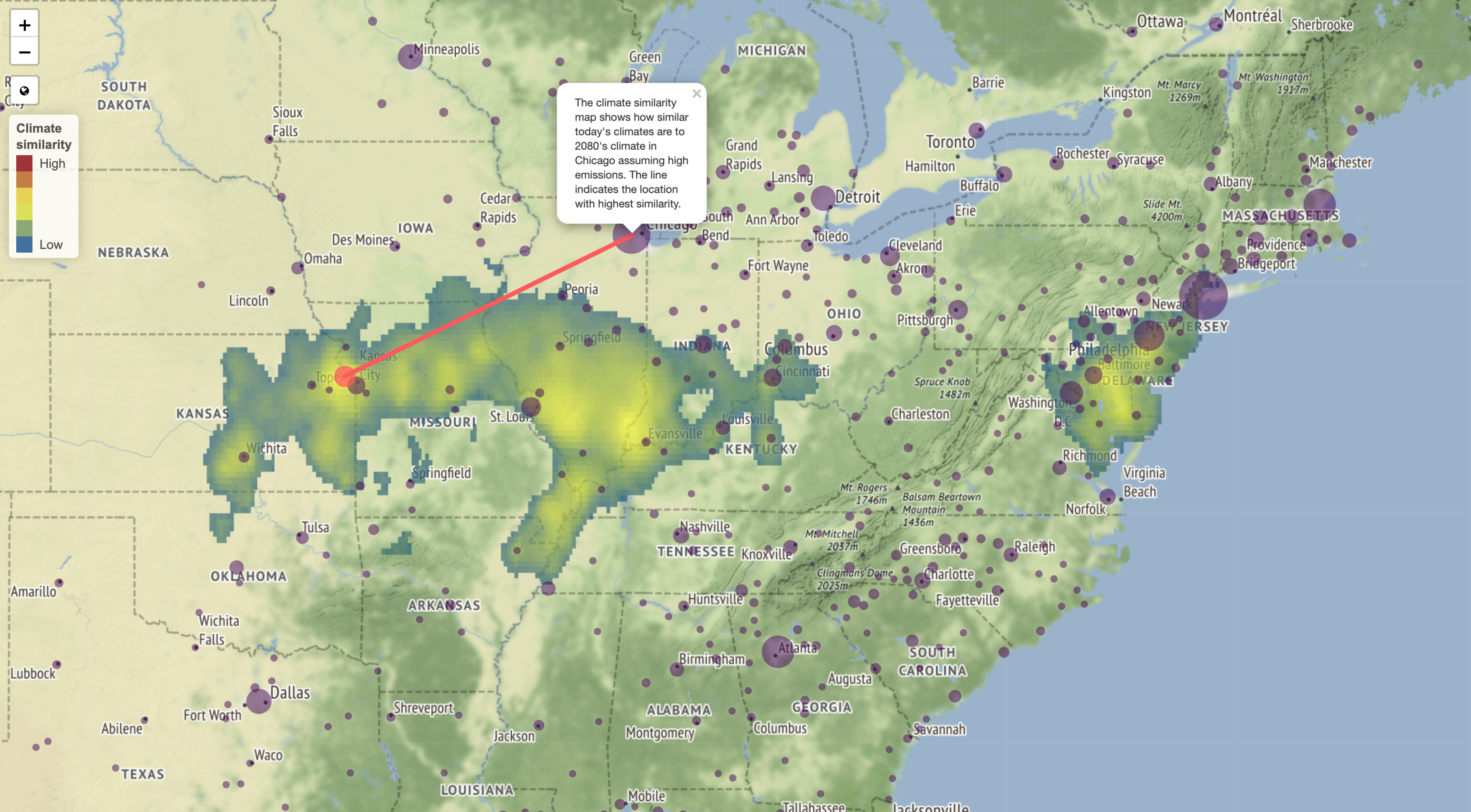
So while these might not be as bad, it still is a swath of the plains and the lower Ohio River Valley. And…yes, a little like today’s climate here in Philadelphia.
From a design standpoint, I probably would have used a light or greyed out map. The colours used to represent the topography are too similar to those used to define the similarity. And that can make it tricky to read.
But the true strength of this piece is the designers’ ability to link tomorrow’s climate to today’s by use of space. And as I said at the beginning, I have been talking about this piece offline for weeks. And I likely will for weeks to come.
Credit for the piece goes to Matthew C. Fitzpatrick and Robert R. Dunn .
Leave a Reply
You must be logged in to post a comment.