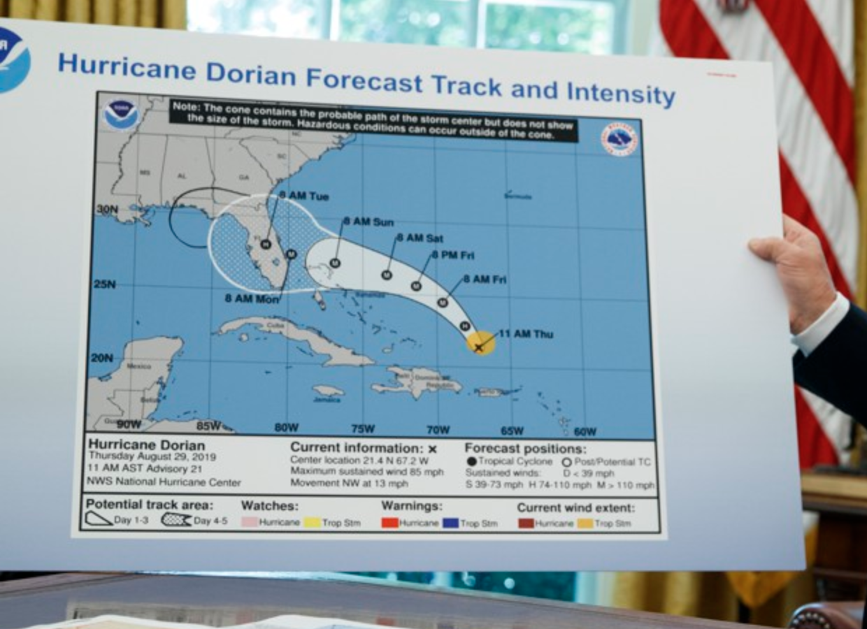
I mean come on, guys, did you really expect me to not touch this one?
Well we made it to Friday, and naturally in the not so serious we have to cover the sharpie map. Because, if the data does not agree with your opinions, clearly the correct response is to just make shit up.
By now you have probably all heard the story about how President Trump tweeted an incorrect forecast about the path of Hurricane Dorian, warning how Alabama could be “hit (much) harder than anticipated”. Except that the forecast at the time was that Alabama wasn’t going to be hit. Cue this map, days later. As in days. As in this news story continued for days.
So to be fair, I went to the NOAA website and pulled down from their archive the cone maps from the date of the graphic Trump edited, and the one from the day when he tweeted about Alabama being hit by the hurricane.
Important to note that this forecast dates from 29 August. This press conference was on 4 September. He tweeted on 1 September. So in other words, two days after he used the wrong forecast, he had printed a big version of a contemporaneously two-day old forecast to show that if he drew a sharpie line on it, it would be correct.
Here is the original, from the National Hurricane Centre, for 29 August. Note, no Alabama.
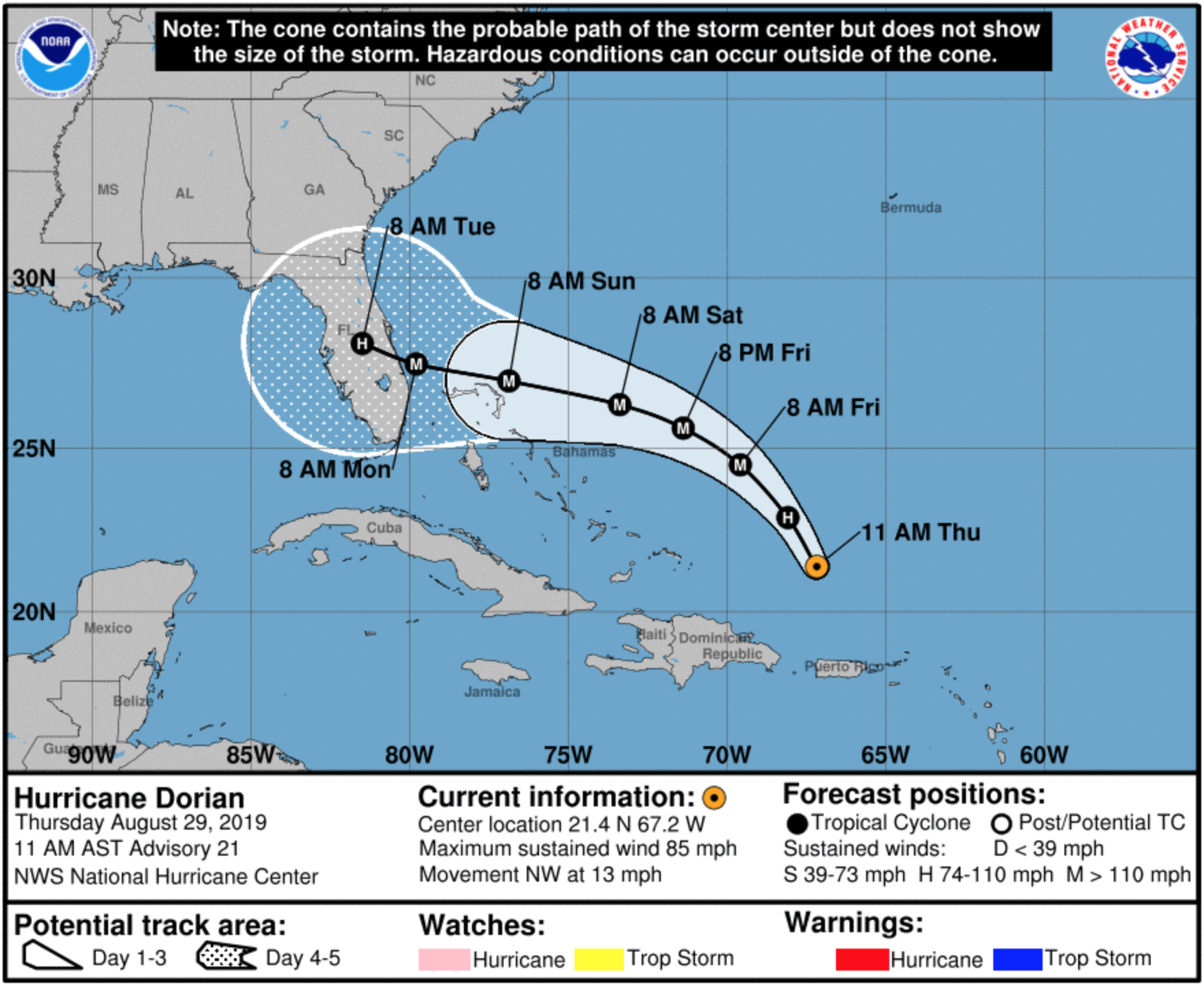
And then Trump tweeted on 1 September. So let’s take the 02.00 Eastern time 1 September forecast from NOAA.
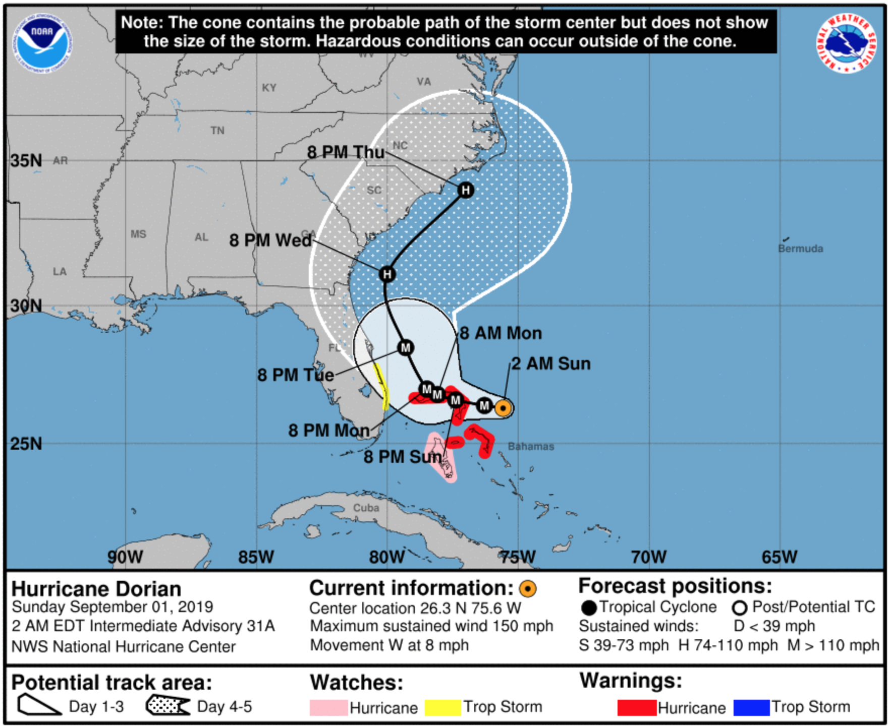
Definitely no Alabama in that forecast.
This could have all gone away if he had just admitted he looked at the wrong forecast and tweeted an incorrect warning. Instead, we had the White House pressuring NOAA to “fix” their tweet.
Now we can all chalk this up as funny. But it does have some serious consequences. Instead of people in the actual path of Dorian preparing, because of the falsely wide range of impacts the president suggested, people in Alabama needlessly prepared for a nonevent.
But more widely, as someone who works with data on a daily basis, we need to agree that data is real. We cannot simply change the data because it does not fit the story we want to tell. If I could take a screenshot of every forecast and string them together in an animated clip, you would see there was never any forecast like the sharpie forecast. We cannot simply create our own realities and choose to live within them, because that means we have no common basis on which to disagree policy decisions that will have real world impacts.
Credit for the photo goes to Evan Vucci of the AP.
Credit for the National Hurricane Centre maps goes to its graphic team.
Leave a Reply
You must be logged in to post a comment.