As many of my readers know, I prefer my weather cooler and summer is probably my least favourite season—weather wise at least. Appropriately, my vaccination will be kicking in just in time for a small, early season heatwave. Felt like an appropriate time to share this piece from Brian Brettschenider.
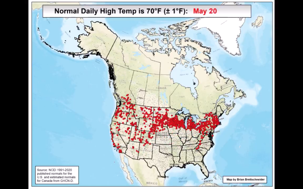
It’s just an animated map showing where in the United States and Canada the daily average high temperature is 70ºF for each day of the year. Here’s where you can expect a daily high of 70ºF for the date of 20 May. Not Philadelphia.
Make sure to click through to watch the video on the Twitter.
Credit for the piece goes to Brian Brettschneider.
Leave a Reply
You must be logged in to post a comment.