In my last post, I commented upon a graphic from the Philadelphia Inquirer where a min/max axis line would have been helpful. This post is a quick follow-up of sorts, because a week ago I flagged something similar for me to perhaps mention on Coffee Spoons. So here I shall mention away.
We have another graphic from the Inquirer in an article about the Philadelphia region’s oppressive humidity this summer. The chart presents its information straightforwardly—bars representing the percentage of hours wherein the dew point sat above 70ºF. Muggy. Muggy as hell. Because I guarantee you the heat in Hell is a humid one. None of the dry dessert heat.
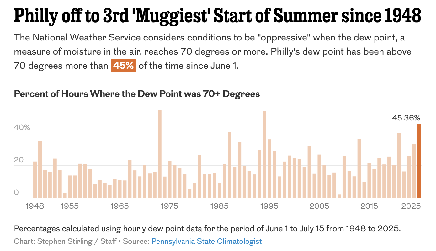
Overall, the graphic works well. It is interactive so you can mouse over the bar and read the precise data point. I love that far more than the increasingly prevalent let’s-label-every-data-point-on-the-chart-and-distract-the-eyeball-from-the-actual-pattern-of-what-is-going-on approach.
This summer has been the third muggiest in Philadelphia in the last three-quarters of a century. The designer highlighted 2025 at the end of the series—not necessary, but I can live with it. But what then stands out are the two muggiest years—two very tall bars. But note that there is no axis line above them. No upper bound. Nothing to help inform the user what percentage point they approach.
I do not always use a maximum or minimum axis line, but usually the outlier has to be extreme, and in that case I will add extra lines around that point to give the user the vital context of scale. Otherwise, the outlier should be just a wee bit above or below the line. I thought I would find a relevant example in my work quickly, but it took nearly 20 minutes of reviewing old work to find one such example.
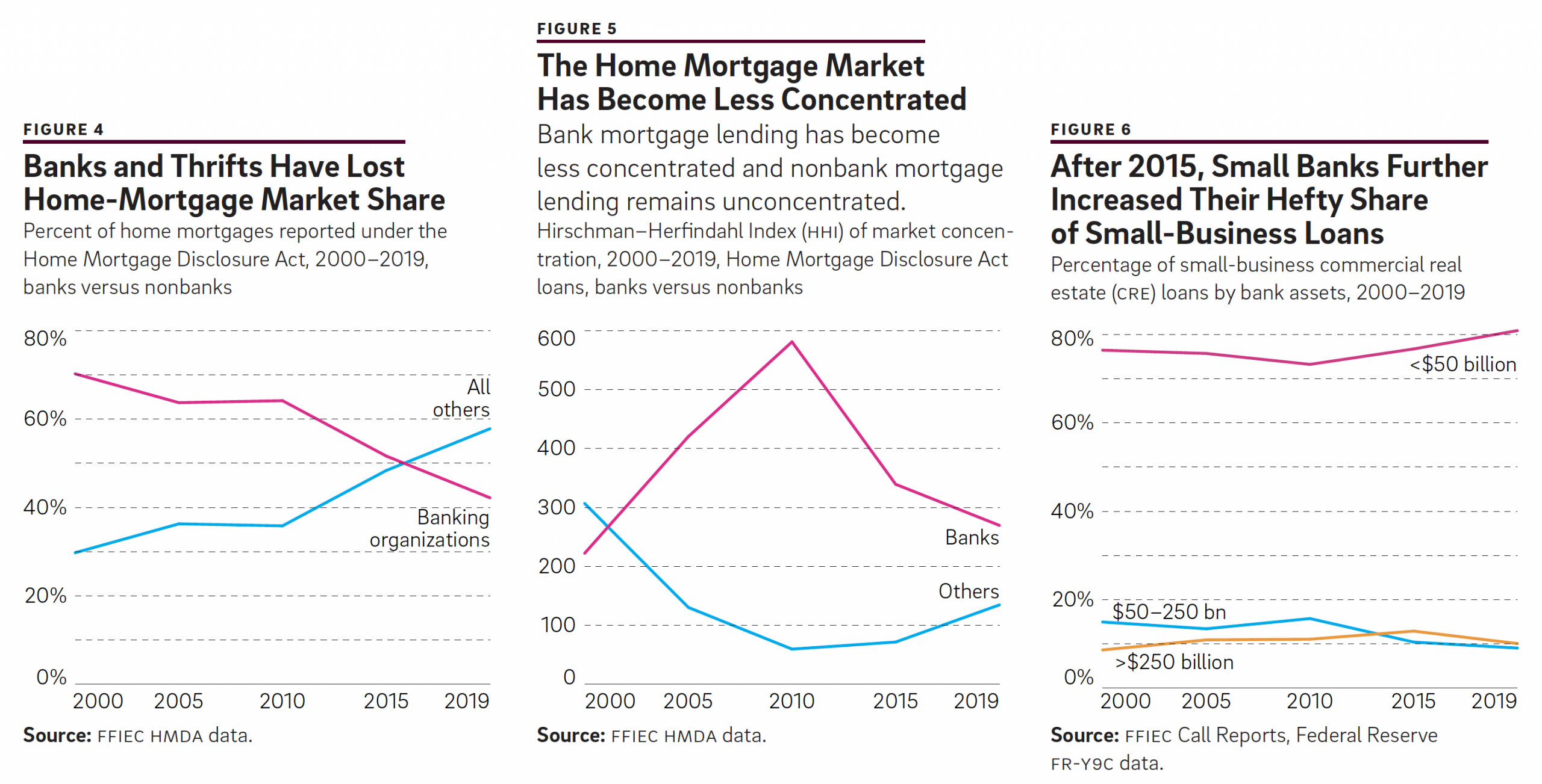
Here you can see in Figure 6 the pink line barely and briefly rises above the 80% maximum. The reader can see the value just pokes above 80% but was otherwise below it during the entire span of time. And that works great.
Again, this is a small critique of the mugginess chart, but I feel an axis line significantly helps the reader see just how muggy those summers were. Spoiler: nearly 54% of the time was “oppressive”.
To play devil’s advocate, perhaps if the article were not about how this is third muggiest summer, the designer could have skipped adding an axis line at 60% or so. But, because such the author placed such emphasis on the third-most bit, the graphic really would benefit from the context of how the 45% thus far for 2025 compares to the top-two summers.
Credit for the piece goes to Stephen Stirling.