Literally.
Last week amongst all the things, the administration released new dietary guidelines, including a brand new food pyramid. The guidelines needed some tweaking as dietary and nutritional science evolves.
The administration made a big deal about replacing the old pyramid with the new pyramid, and you can see the comparison here.
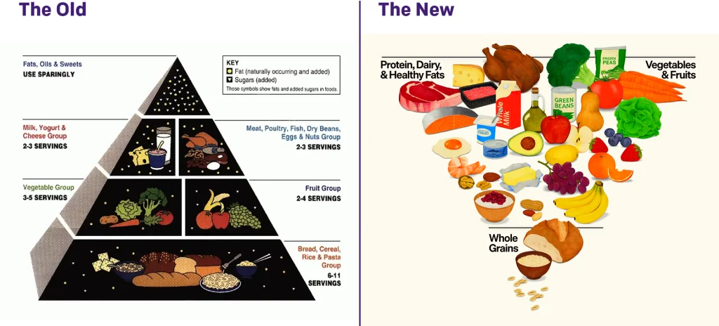
I am not a scientist. I don’t even play one on television. So I will keep my thoughts to the design—although I will say that is a lot of steak and turkey…
My first thought about the design? Pyramids are an incredibly strong and stable shape. Just look over at Giza to see how stable a pyramid is compared to the tower that is the Lighthouse of Alexandria or the man-shaped Colossus of Rhodes.
But when you flip the script and turn the pyramid upside down…you place all the weight at the top and focus the pressure on the tip of the pyramid. That is an incredibly unstable design, and I have to wonder do we want that implicit communication in a message to people about how to be healthy?
The other point I would make is that the new pyramid does not just explicitly reference the older pyramid, but quietly and without mention replaces the MyPlate initiative of the Obama administration.

The plate design worked better from a personal planning standpoint because the circular plate is—usually—the device upon which we eat our meals. (The whole square meal thing, as I was taught, originated with the Royal Navy, which served three meals a day to sailors on wooden, square-shaped plates.) And who doesn’t like a small side dish of cheese with their meals?
I cannot say an inverted pyramid showing the aforementioned steak and turkey provides the same instructional use of what people should be placing on their plates.
Either the right-side-up pyramid of the healthy plate design works best from a design perspective. Though, to be clear, I have no real thoughts on what the division of the simplified three categories should be. But would I eat a wedge of cheese half the size of a turkey? Yes, yes I would.
Credit for the new pyramid goes to the National Design Studio.
Credit for the older works I cannot find, but if anyone does, please let me know.