Tag: data visualisation
-
Legendary Adjustments
The other day I was reading an article about the coming property tax rises in Philadelphia. After three years—has anything happened in those three years?—the city has reassessed properties and rates are scheduled to go up. In some neighbourhoods by significant amounts. I went down the related story link rabbit hole and wound up on…
-
Warming Towards Women Leaders
We are going to start this week off with a nice small multiple graphic that explores the reducing resistance to women in positions of leadership in Arab countries. The graphic comes from a BBC article published last week. These kinds of graphics allow a reader to quickly compare the trajectory of a thing between a…
-
It’s a Little Steamy Out There
And by out there I mean 1150 light years away. One of the five amazing images out of the first day’s announcement by the James Webb Space Telescope (JWST) team was not a sexy photo of a nebula or a look back 13.5 billion years in time. Instead it was a plot of the amount…
-
Those Quirky Quarks
Last week scientists working at the Large Hadron Collider in Switzerland announced the discovery of new sub-atomic particles: a pentaquark and tetraquarks. This BBC article does a really good job of explaining the role of quarks in the composition of our universe, so I encourage you to read the article. But they also included a…
-
Choo Choo
I took two weeks off as work was pretty crazy, but we’re back to covering data visualisation and design with a graphic about trains. And anybody who knows me knows how I love trains. One of the early acts of the Biden administration was funding a proper expansion of rail service in the United States.…
-
Turn Down the Heat
First, as we all should know, climate change is real. Now that does not mean that the temperature will always be warmer, it just means more extreme. So in winter we could have more severe cold temperatures and in hurricane season more powerful storms. But it does mean that in the summer we could have…
-
New Mexico Burns
Editor’s note: I was having some technical issues last week. This was supposed to post last week. Editor’s note two: This was supposed to go up on Monday. Still didn’t. Third time’s the charm? Yesterday I wrote about a piece from the New York Times that arrived on my doorstep Saturday morning. Well a few…
-
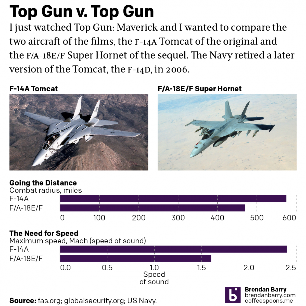
Top Gun
Last night I went to see Top Gun: Maverick, the sequel to the 1986 film Top Gun. Don’t worry, no spoilers here. But for those that don’t know, the first film starred Tom Cruise as a naval aviator, pilot, who flew around in F-14 Tomcats learning to become an expert dogfighter. Top Gun is the…
-
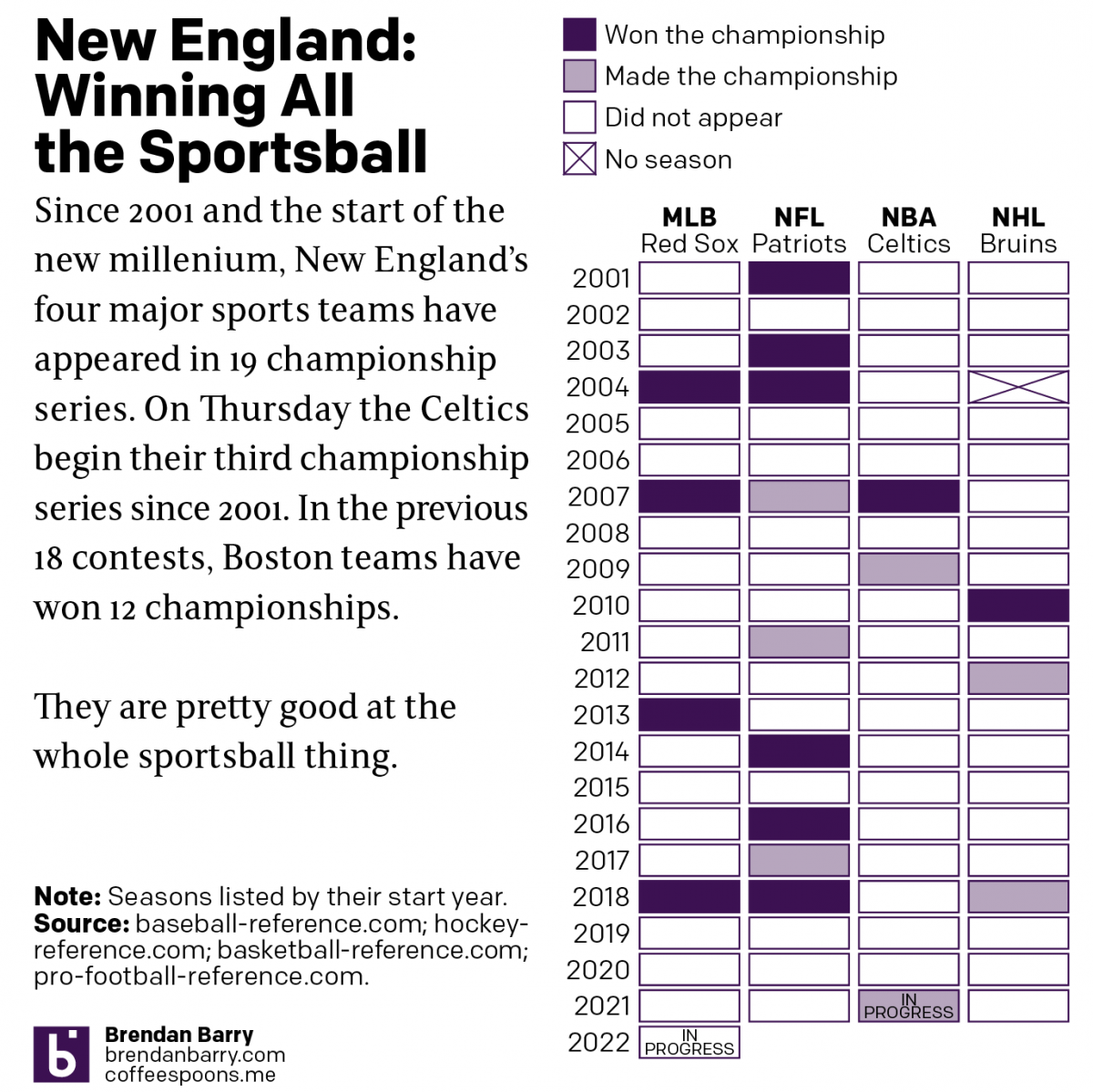
Boston: Sportstown of the 21st Century
Tonight the Boston Celtics play in Game 1 of the NBA Finals against the Golden State Warriors, one of the most dominant NBA teams over the last several years. But since the start of the new century and the new millennium, more broadly Boston’s four major sports teams have dominated the championship series of those…