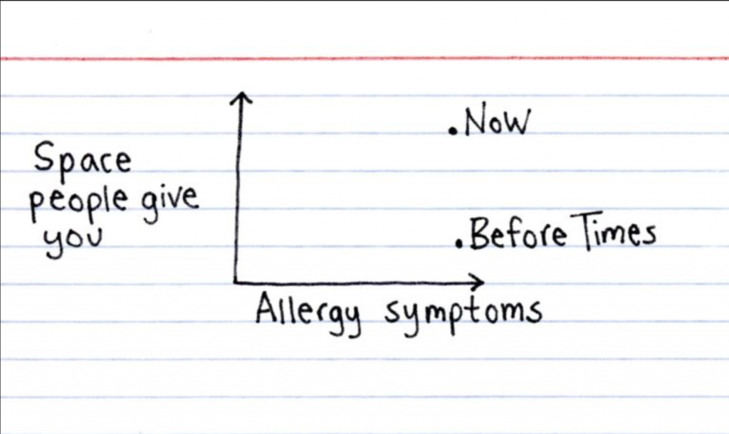
If all goes according to plan, I should be receiving my second dose of Pfizer later this afternoon. Then it’s two more weeks until I’m fully vaccinated and ready to rejoin the world. But what kind of world will be rejoining? The allergy plagued one looking at the calendar. And that’s why this post from Indexed by Jessica Hagy made me laugh.
Yesterday I wrote my usual weekly piece about the progress of the Covid-19 pandemic in the five states I cover. At the end I discussed the progress of vaccinations and how Pennsylvania, Virginia, and Illinois all sit around 25% fully vaccinated. Of course, I leave my write-up at that. But not everyone does.
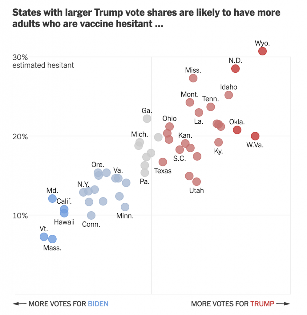
This past weekend, the New York Times published an article looking at the correlation between Biden–Trump support and rates of vaccination. Perhaps I should not be surprised this kind of piece exists, let alone the premise.
From a design standpoint, the piece makes use of a number of different formats: bars, lines, choropleth maps, and scatter plots. I want to talk about the latter in this piece. The article begins with two side by side scatter plots, this being the first.
Hesitancy rates compared to the election results
The header ends in an ellipsis, but that makes sense because the next graphic, which I’ll get to shortly, continues the sentence. But let’s look at the rest of the plot.
Starting with the x-axis, we have a fairly simple plot here: votes for the candidates. But note that there is no scale. The header provides the necessary definition of being a share of the vote, but the lack of minimum and maximum makes an accurate assessment a bit tricky. We can’t even be certain that the scales are consistent. If you recall our choropleth maps from the other day, the scale of the orange was inconsistent with the scale of the blue-greys. Though, given this is produced by the Times, I would give them the benefit of the doubt.
Furthermore, we have five different colours. I presume that the darkest blues and reds represent the greatest share. But without a scale let alone a legend, it’s difficult to say for certain. The grey is presumably in the mixed/nearly even bin, again similar to what I described in the first post about choropleths from my recent string.
Finally, if we look at the y-axis, we see a few interesting decisions. The first? The placement of the axis labels. Typically we would see the labelling on the outside of the plot, but here, it’s all aligned on the inside of the plot. Intriguingly, the designers took care for the placement—or have their paragraph/character styles well set—as the text interrupts the axis and grid lines, i.e. the text does not interfere with the grey lines.
The second? Wyoming. I don’t always think that every single chart needs to have all the outliers within the bounds of the plot. I’ve definitely taken the same approach and so I won’t criticise it, but I wonder what the chart would have looked like if the maximum had been 35% and the grid lines were set at intervals of 5%. The tradeoff is likely increased difficulty in labelling the dots. And that too is a decision I’ve made.
Third, the lack of a zero. I feel fairly comfortable assuming the bottom of the y-axis is zero. But I would have gone ahead and labelled it all the same, especially because of how the minimum value for the axis is handled in the next graphic.
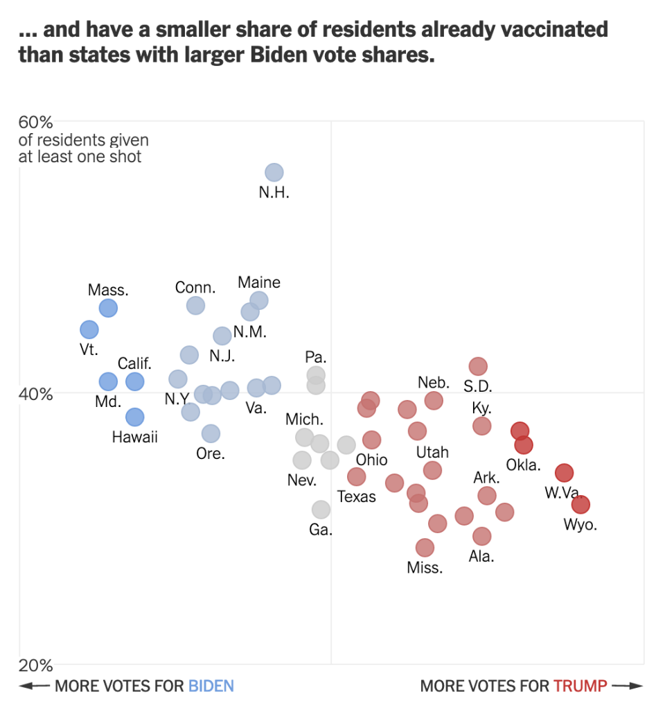
Speaking of, moving on to the second graphic we can see the ellipsis completes the sentence.
Vaccination rates compared to the election results
We otherwise run into similar issues. Again, there is a lack of labelling on the x-axis. This makes it difficult to assess whether we are looking at the same scale. I am fairly certain we are, because when I overlap the graphics I can see that the two extremes, Wyoming and Vermont, look to exist on the same places on the axis.
We also still see the same issues for the y-axis. This time the axis represents vaccination rates. I wish this graphic made a little clearer the distinction between partial and full vaccination rates. Partial is good, but full vaccination is what really matters. And while this chart shows Pennsylvania, for example, at over 40% vaccinated, that’s misleading. Full vaccination is 15 points lower, at about 25%. And that’s the number that needs to be up in the 75% range for herd immunity.
But back to the labelling, here the minimum value, 20%, is labelled. I can’t really understand the rationale for labelling the one chart but not the other. It’s clearly not a spacing issue.
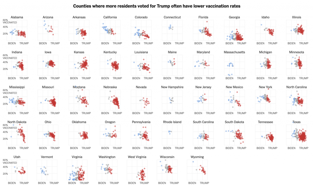
I have some concerns about the numbers chosen for the minimum and maximum values of the y-axis. However, towards the middle of the article, this basic construct is used to build a small multiples matrix looking at all 50 states and their rates of vaccination. More on that in a moment.
My last point about this graphic is on the super picky side. Look at the letter g in “of residents given”. It gets clipped. You can still largely read it as a g, but I noticed it. Not sure why it’s happening, though.
So that small multiples graphic I mentioned, well, see below.
All 50 states compared
Note how these use an expanded version of the larger chart. The y-minimum appears to be 0%, but again, it would be very helpful if that were labelled.
Also for the x-axis in all the charts, I’m not sure every one needs the Biden–Trump label. After all, not every chart has the 0–60% range labelled, but the beginning of each row makes that clear.
In the super picky, I wish that final row were aligned with the four above it. I find it super distracting, but that’s probably just me.
Overall, this is a strong piece that makes good use of a number of the standard data visualisation forms. But I wish the graphics were a bit tighter to make the graphics just a little clearer.
Credit for the piece goes to Danielle Ivory, Lauren Leatherby and Robert Gebeloff.
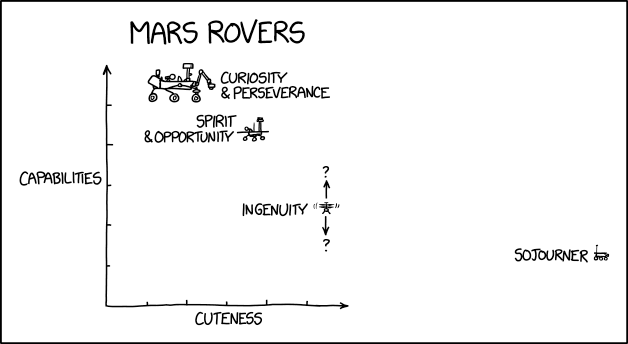
Perseverance landed on Mars on 18 February, almost a month ago. The video and photography the rover has already sent back has been stunning. We all know she is the most capable rover yet landed on the Red Planet, but what we all want to know is how cute is Perseverance compared to her predecessors?
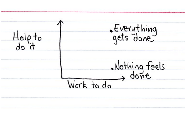
This week I’m on deadline for the magazine I produce. Technically, the files go out Monday, but I spend Monday double/triple-checking things and assembling all the packages I need and so everything really needs to be done the day before, for this quarter, that’s today. Regardless, that means little sleep and craziness.
Over at Indexed, Jessica Hagy nailed how I feel this time every quarter with a simple scatter plot entitled “‘You Look Tired’.”
But I have an intern joining me for the summer, so huzzah for Q3.
The thing with election results is that we don’t have the final numbers for a little while after Election Day. And that’s normal.
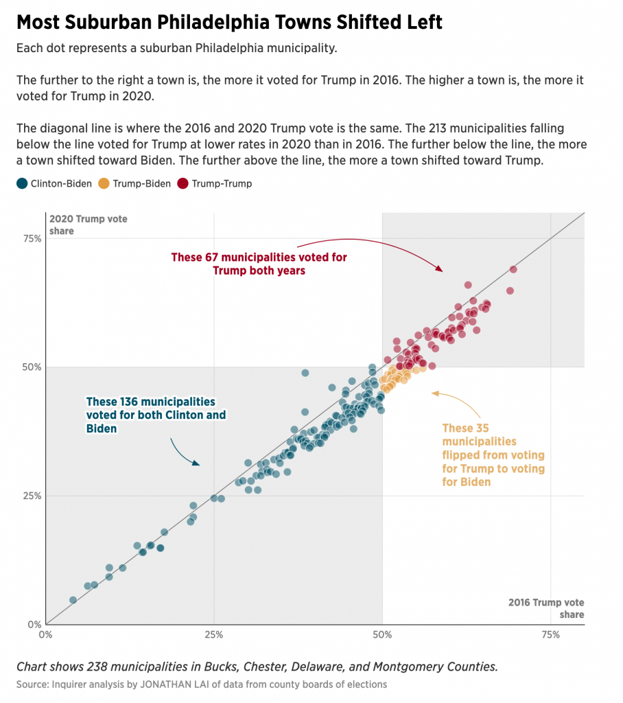
There are a few things I want to look at in the coming weeks and months once my schedule eases up a bit. But for now, we can use this nice piece from the Philadelphia Inquirer to look at a story close to home: the vote in the Philadelphia suburbs.
It’s all happening in the yellow.
I’ve already looked at some analysis like this for Wisconsin and I shared it on my social. But there I looked at the easy, county-level results. What the Inquirer did above is break down the Pennsylvania collar counties of Philadelphia, i.e. the suburbs, into municipality level results. It then plotted them 2020 vs. 2016 and the results were—as you can guess since we know the result—Biden beat Trump.
What this chart does well is colours the municipalities that Biden flipped yellow. It’s a great choice from a colour standpoint. As the third of the primaries, with both blue and red well represented, it easily contrasts with the Biden- and Trump-won towns and cities of the region. The colour is a bit “darker” than a full-on, bright yellow, but that’s because the designers recognised it needs to stand out on a white field.
Let’s face it, yellow is a great colour to use, but it’s difficult because it’s so light and sometimes difficult to see. Add just the faintest bit of black to your mix, especially if you’re using paints, and voila, it works pretty well. So here the designer did a great job recognising that issue with using yellow. Though you can still see the challenge, because even though it is a bit darker, look at how easy it is to read the text in the blue and the red. Now compare that to the yellow. So if you’re going to use yellow, you want to be careful how and when you do.
The other design decision here comes down to what I call the explorative vs. the narrative. Now, I don’t think explorative is a word—and the red squiggle agrees—but it pairs nicely with narrative. And I’ve been talking about this a lot in my field the last several works, especially offline. (In the non-blog sense, because obviously all my work is done online these days. Oh, how I miss my old office.)
Explorative works present the user with a data set and then allow them to, in this case, mouse over or tap on dots and reveal additional layers of information, i.e. names and specific percentages. The idea is not to tell a specific story, but show an overall pattern. And if the piece is interactive, as this is, potentially allow the user to drill down and tease out their own stories.
Compare that to the narrative, my Wisconsin piece I referenced above is more in this category. Here the work takes you through a guided tour of the data. It labels specific data points, be them on trend or outliers and is sometimes more explicit in its analysis. These can also be interactive—though my static image is not—and allow users to drill down, and critically away, from the story to see dots of interest, for example.
This piece is more explorative. The scatter plot naturally divides the municipalities into those that voted for Biden, Trump, and then more or less than they voted for Trump in 2016. The labels here are actually redundant, but certainly helpful. I used the same approach in my Wisconsin graphic.
But in my Wisconsin graphic, I labelled specific counties of interest. If I had written an accompanying article, they would have been cited in the textual analysis so that the graphic and text complemented each other. But here in the Inquirer, it’s a bit of a missed opportunity in a sense.
The author mentions places like Upper Darby and Lower Merion and how they performed in 2020 vis-a-vis 2016. But it’s incumbent on the user to find those individual municipalities on the scatter plot. What if the designer had created a version where the towns of interest were labelled from the start? The narrative would have been buttressed by great visualisations that explicitly made the same point the author wrote about in the text. And that is a highly effective form of communication when you’re not just telling, but also showing your story or argument.
Overall it’s a great article with a lot to talk about. Because, spoiler, I’m going to be talking about it again tomorrow.
After working pretty much non-stop all spring and summer, your humble author finally took a few days off and throw in a bank holiday and you are looking at a five-day weekend. But, because this is 2020 travelling was out of the question and so instead I hunkered down to finish writing/designing an article I have been working on for the last several weeks/few months.
The main write-up—it is a lengthy-ish read so you may want to brew a cup of tea—is over at my data projects site. This is the first project I have really written about for that since spring/summer 2016. Some of my longer-listening readers may recall that the penultimate piece there I wrote about Pennsyltucky was inspired by work I did here at Coffeespoons.
To an extent, so is this piece. I wrote about Trumpsylvania, the political realignment of the state of Pennsylvania. 2016 and the state’s vote for Donald Trump was less an aberration than many think. It was the near-end result of a decades-long transformation of the state’s political geography. And so I looked at the data underlying the shift and how and where it occurred.
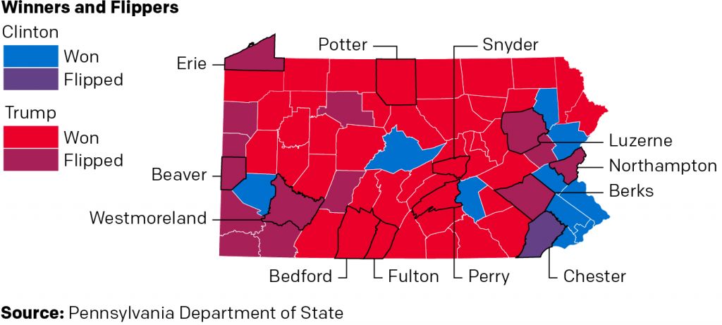
And originally, I had a slightly different conclusion as to how this related to Pennsylvania in the upcoming 2020 election. But, the whole 2020 thing made me shift my thinking slightly. But you’ll have to read the whole thing to understand what I’m talking about. I will leave you with one of the graphics I made for the piece. It looks at who won each county in the state, but also whether or not the candidate was able to flip the county. In other words, was Clinton able to flip a Republican county? Was Trump able to flip a Democratic county?
Who won what? Who flipped what?
Let me know what you think.
And of course, many, many thanks to all the people who suffered my ideas, thoughts, and early drafts over the last several weeks. And even more thanks to those who edited it. Any and all mistakes or errors in the piece are all mine and not theirs.
This is from a social media post I made a few days ago, but think it may be of some relevance/interest to my Coffeespoons followers. I was curious to see at 30+ days from the general election, how has the landscape changed for the two parties since 2016?
Well, this project has driven me to a related, but slightly different project that has been consuming my non-work time. Hopefully I will have more on that in the coming days. Without further ado, the post:
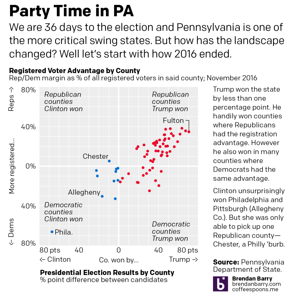
Pennsylvania will likely be one of the more critical battleground swing states in this year’s election. In 2016, then candidate Trump won the state by less than one percentage point. But four years is a long time and I was curious to see how things have changed.
In the first chart on the right we see counties won by Trump and on the left, Clinton. The further from the centre, the greater the candidate’s margin of victory over the other. The top half plots registered Republicans’ margin over Democrats as a percentage of all registered voters in the county (including independents and third party) and the bottom half does the same for Democrats. Closer to the centre, the more competitive, further away, less so.
Trump’s key to victory was the white, working class voter clustered in the west and the northeast of the state–old mining and steel towns. There Democrats normally counted on organised labour support as registered Democrats. That all but collapsed in 2016. The bottom right shows a number of nominally Democratic counties Trump won, whereas Clinton only picked up one Republican county, Chester.
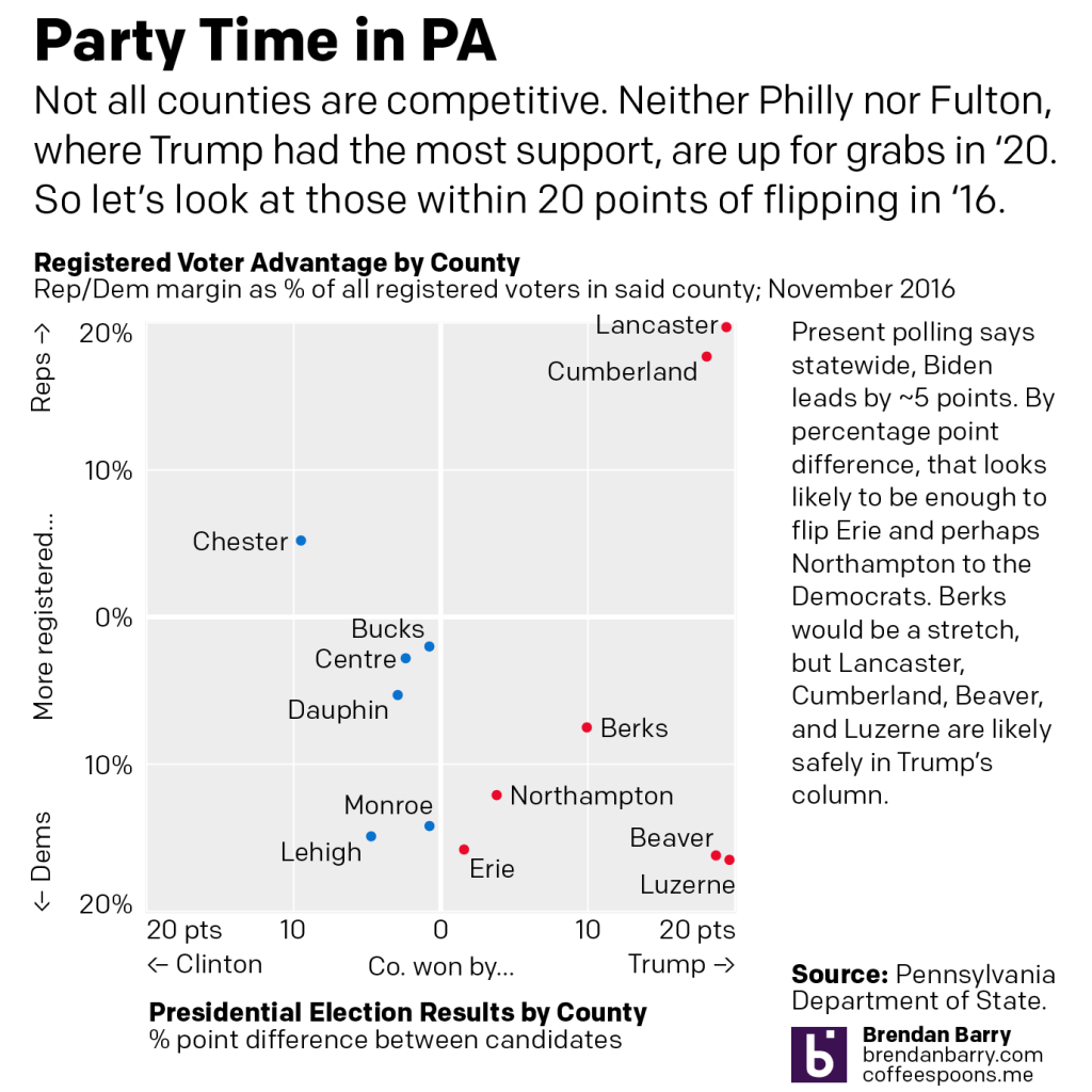
But what are PA’s battlegrounds?
In the second chart we ignore places like Philly and Fulton County and zoom in on more competitive counties within 20 point margins. Polls presently point to a Biden lead of about 5 points in PA. If every dot moved left by 5 points (it doesn’t really work like that), we only see Erie and Northampton with potential to flip.
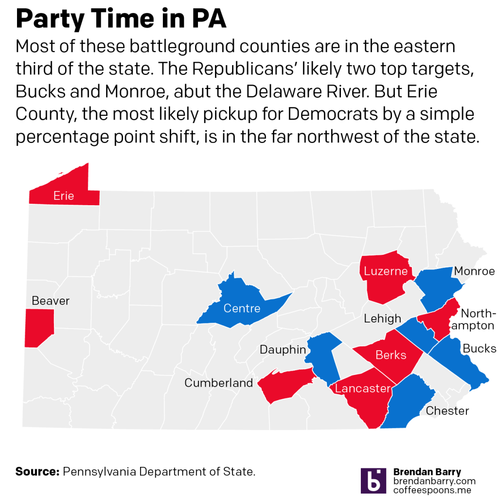
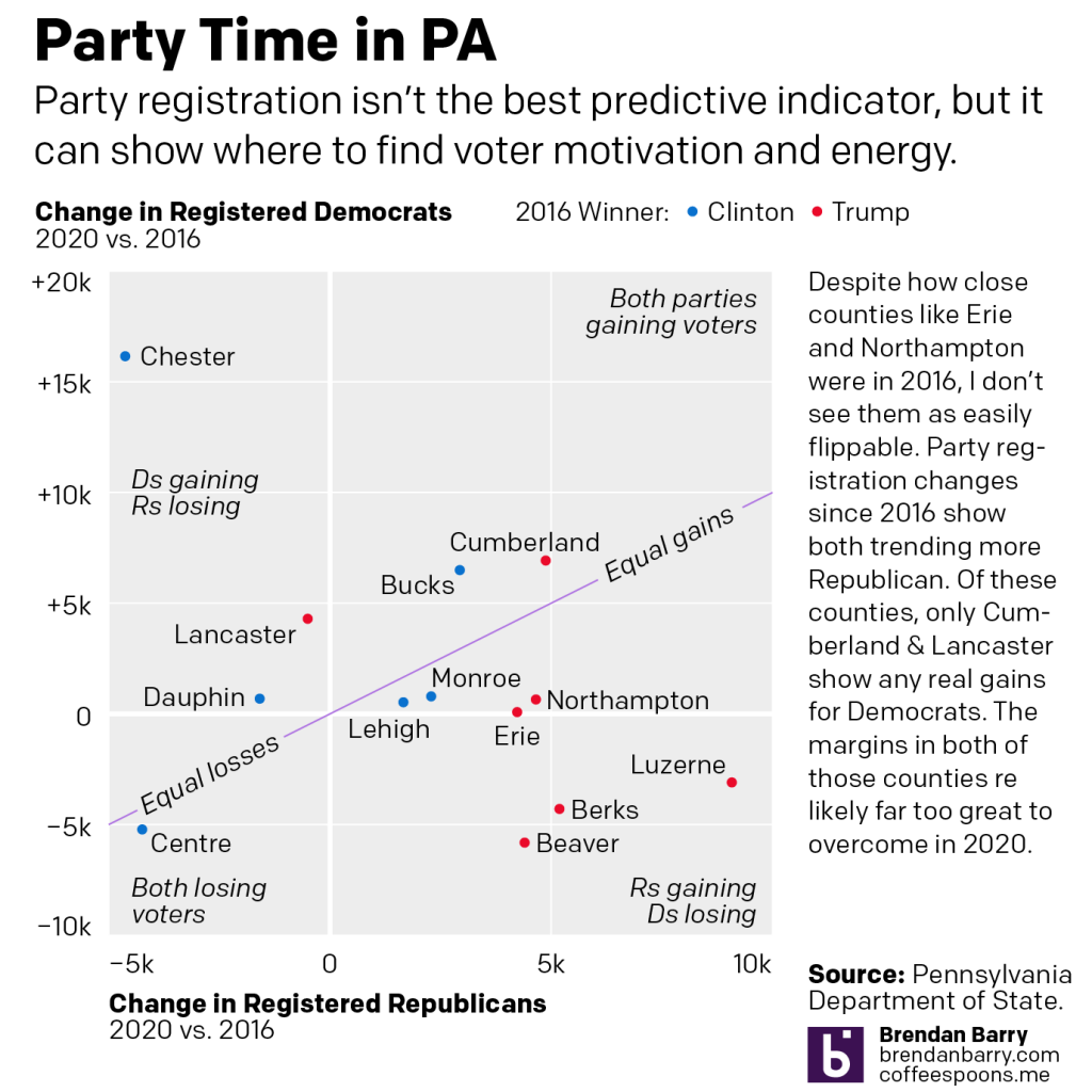
But Trump’s realignment of politics is accelerating (more on this another day) a realignment of PA’s political geography.
In the fourth chart, neither Erie nor Northampton show any real movement via party registration back to Democrats. Erie may flip, but Northampton’s likely a stretch. Places like Cumberland and Lancaster counties are too solidly Republican to flip this year. Instead Trump is more likely to flip counties like Monroe and Lehigh red, even if he loses the state.
Because, not shown, the key to a Biden victory will be running up the margins in Philly & Pittsburgh, and to a lesser extent Philly’s four collar counties, including Chester, which appears to be rapidly shifting in Democrats’ favour.
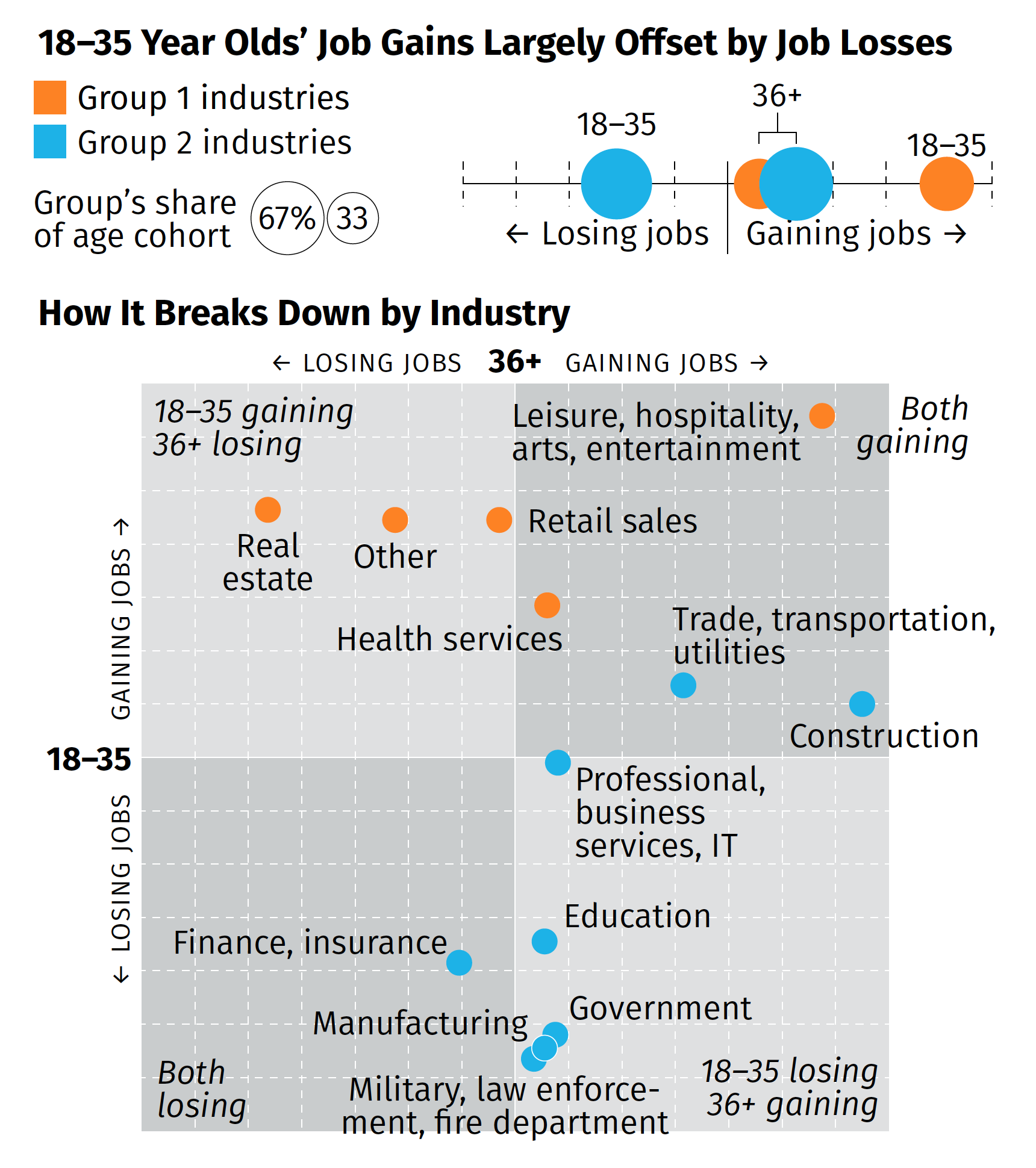
Earlier this week, some of the work work my team does was published. We produced a one-page summary of a far larger and more comprehensive (relative to the scope of the summary) survey of consumers during the Covid Recession. I will spare you the details of recreating existing templates from scratch and the design decisions that went into that bit—neither insignificant nor unsubstantial—and rather focus on the one graphic we designed.
The broad thrust of the summary is that while overall we are beginning to see some job recovery, that the recovery is uneven and that, in fact, those below the age of 36 are getting hit pretty hard (my words, not the authors). That while in some industries the young are recovering in good numbers, in other industries, industries with a larger share of the youth population, young people are still losing jobs. Then we broke those top line numbers out by industries in the below graphic captured by screenshot.
There are a couple of things from a design side to discuss. We had about two or three days from when we started the project to develop some ideas and then execute and produce the summary. And as I noted above, that also included quite a bit of time in emulating existing documents and building ourselves a new template should we need to do something similar in the future.
But for that graphic in particular, there’s one thing I wanted to highlight: the lack of values on the axis. The challenge here was that the data displayed is people not working. And when we compared this time period (Wave 3) to the earlier waves, we were looking for declines. And so if we going to say that 36+ are gaining construction jobs, that would be -2% value and the youth are about a -13% increase. If you are doing a bit of a double-take at a negative increase, so did the team. Ultimately, we used the data to generate the chart, but then opted for qualitative labelling on the axes. They simply point that in one direction, youth are either gaining or losing jobs, and the same for the 36+. To reinforce this idea, we also added some descriptors in the far corner of each quadrant that said whether the age groups were gaining or losing jobs.
Despite the unusual design decisions I took in the graphic, I’m really proud of this piece especially given its tight turnaround. It shows in almost real-time how fractured the recovery—is this a recovery?—is at this point.
Credit for the piece goes to the team on this, Tom Akana, Kate Gamble, Natalie Spingler, and myself.
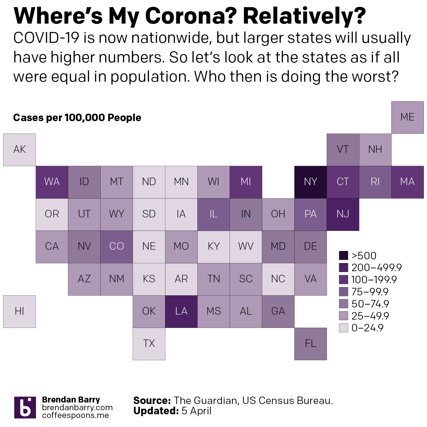
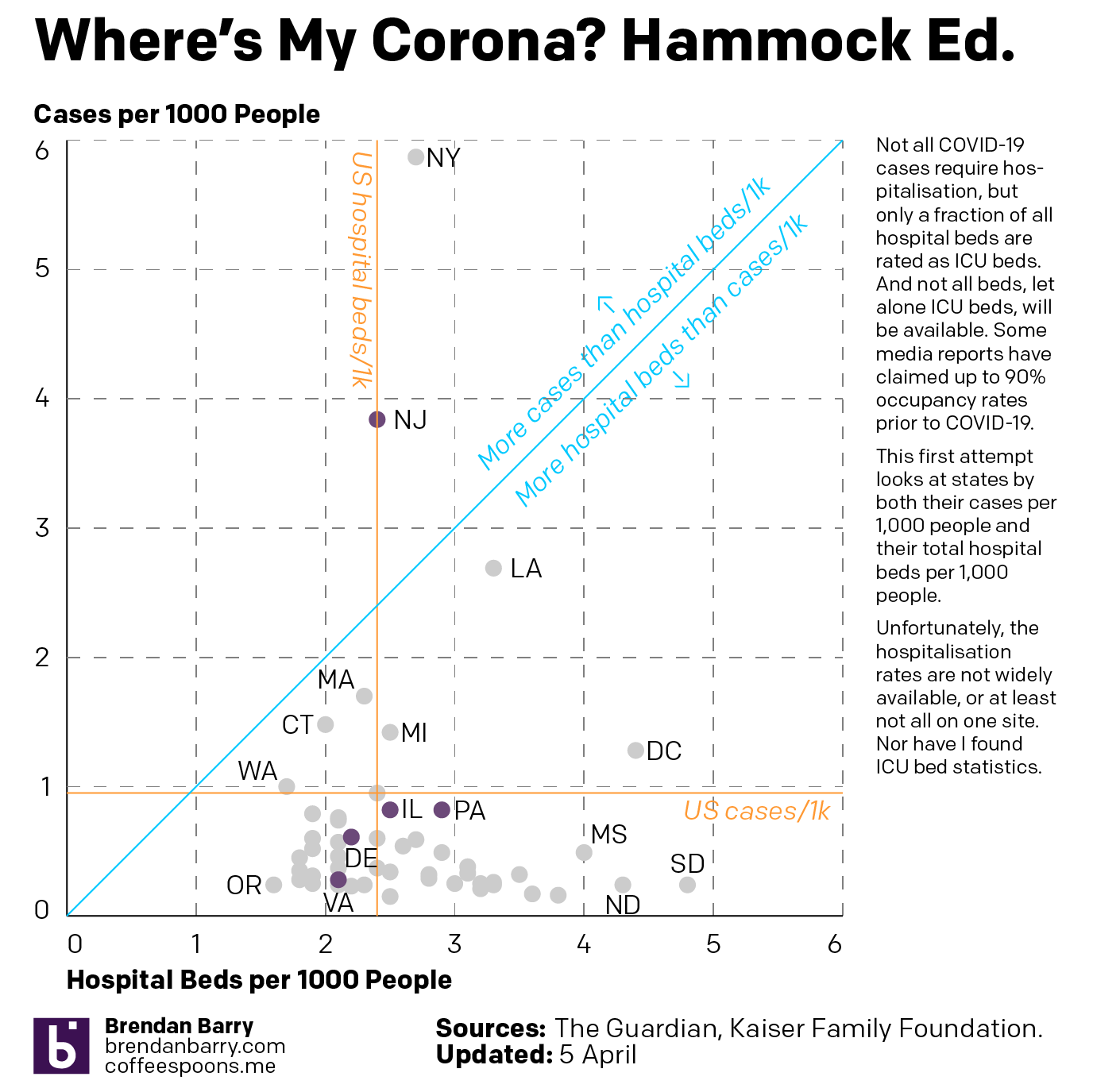
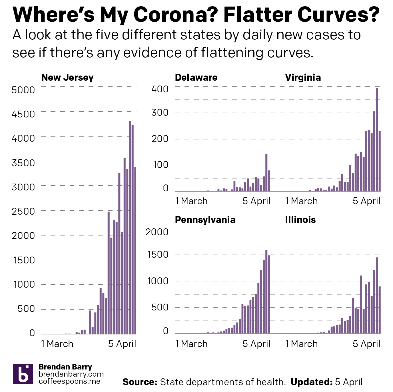
This past weekend I continued looking at the spread of COVID-19 across the United States. But in addition to my usual maps of Pennsylvania, New Jersey, Delaware, Virginia, and Illinois, I also looked at the number of cases across the United States adjusted for population. I then looked at the five aforementioned states in terms of new cases to see if the curve is flattening. Finally, I looked at the number of hospital beds per 1000 people vs the number of cases per 1000 people.
The latter in particular I wanted to be an examination of hospitalisation rates vs ICU beds, which are a small fraction of total hospital beds. But as I could not find that data, I made do with overall cases and overall beds.
So first let’s look at the cases across the U.S. What you can see is that whilst New York and New Jersey do have some of the worst of the impact, Washington is still not great and Louisiana and Michigan are also suffering.
The situation across the United States
And then when we look at the states by their cases per 1000 people and their hospital beds per 1000 people, we see that the states often claimed to be overwhelmed, New York, New Jersey, and Washington are all well over the blue line, which indicates an equal number of beds and cases per 1000 people, or near it. Because it is important to remember that not all beds are the type needed for COVID-19 victims, who often require the more fully kitted out ICU beds. Additionally, not all cases are severe enough to warrant hospitalisation.
Cases per 1k people vs hospital beds per 1k people
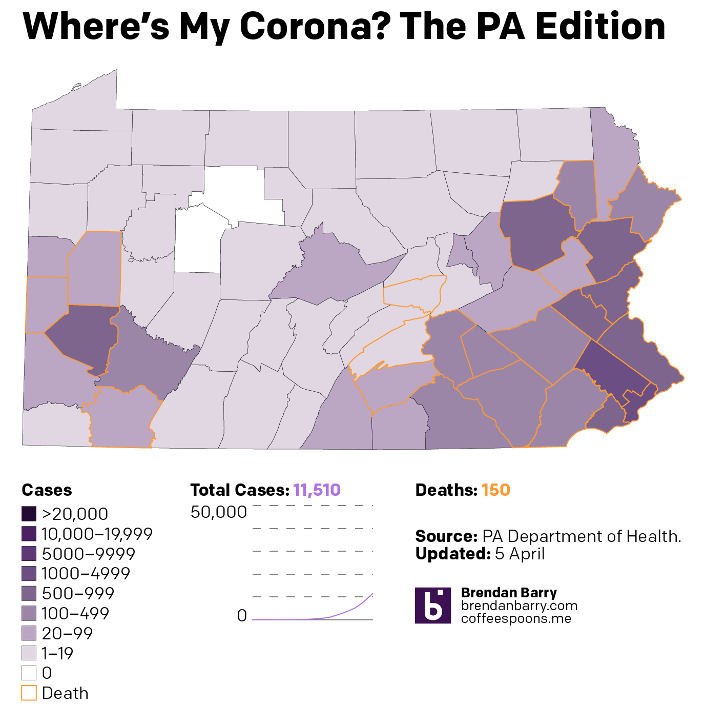
Then from the broader national view, we can look at the states of interest. Here, those of you who have been following my social media posts, you can see fewer dark purples in these maps. That’s because I have adopted a new palette that has sacrificed granularity at the lower end of the scale and added it at the top, a particular need in New Jersey and the Philadelphia and Chicago metro areas. And finally we look at the daily new cases to see if that curve is flattening.
Pennsylvania now has almost every county infected. But unlike Illinois, which has a similar infection rate but more unaffected counties, Pennsylvania has fewer cases in its big city, Philadelphia, and has more cases in the smaller cities and towns.
The situation in Pennsylvania
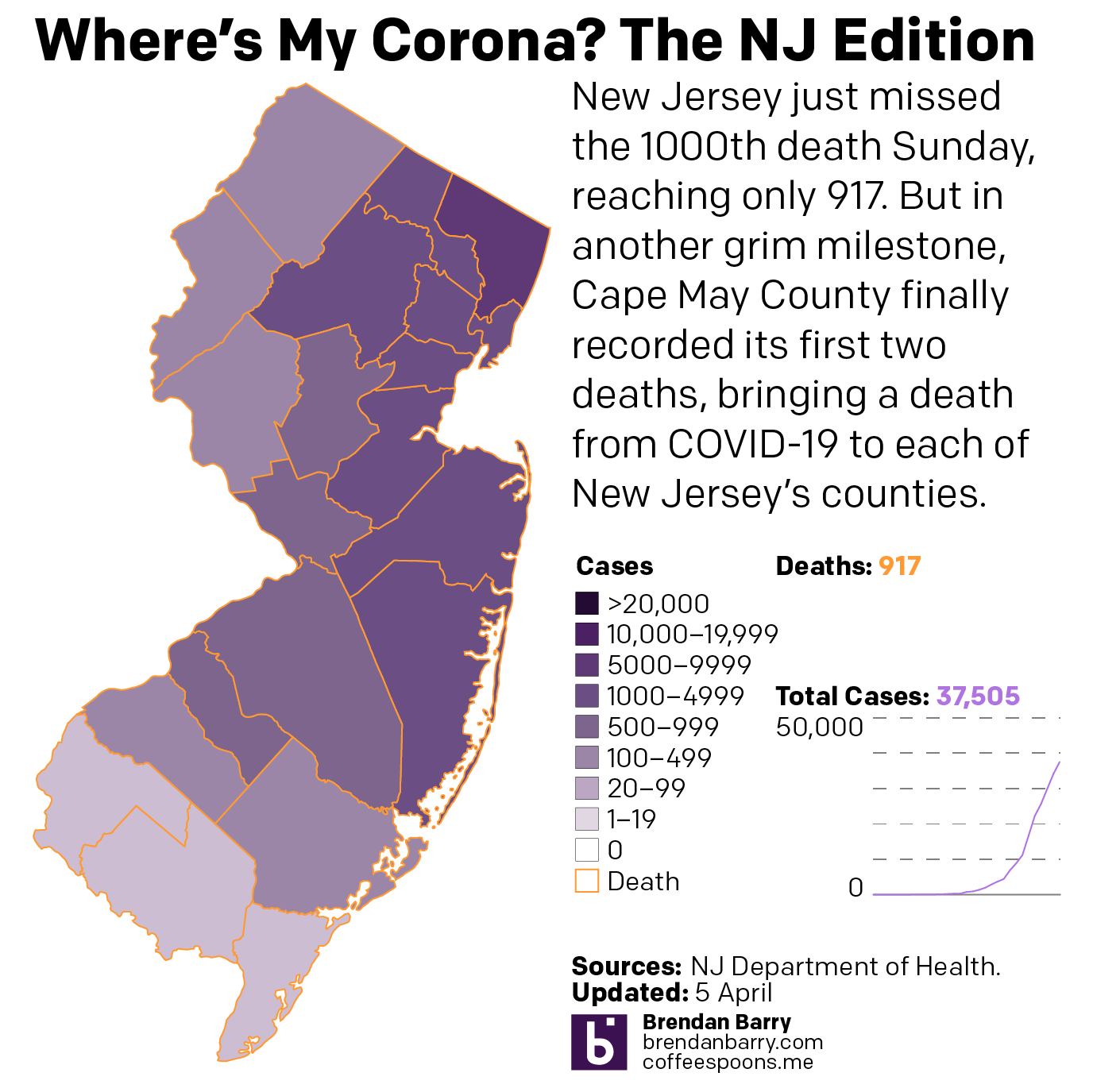
New Jersey is just a disaster. Deaths are now reported in every county—so I can probably remove those orange outlines. The only potential good news is that new cases for the second day in a row were fewer than the day before. It could be a blip. But it could also be a signal that the peak of infection has or is nearing. That said, hospitalisations and deaths are lagging indicators and could take two weeks to follow the positive test results. So in the best case scenario that this is a peak, New Jersey is far from out of the woods.
The situation in New Jersey
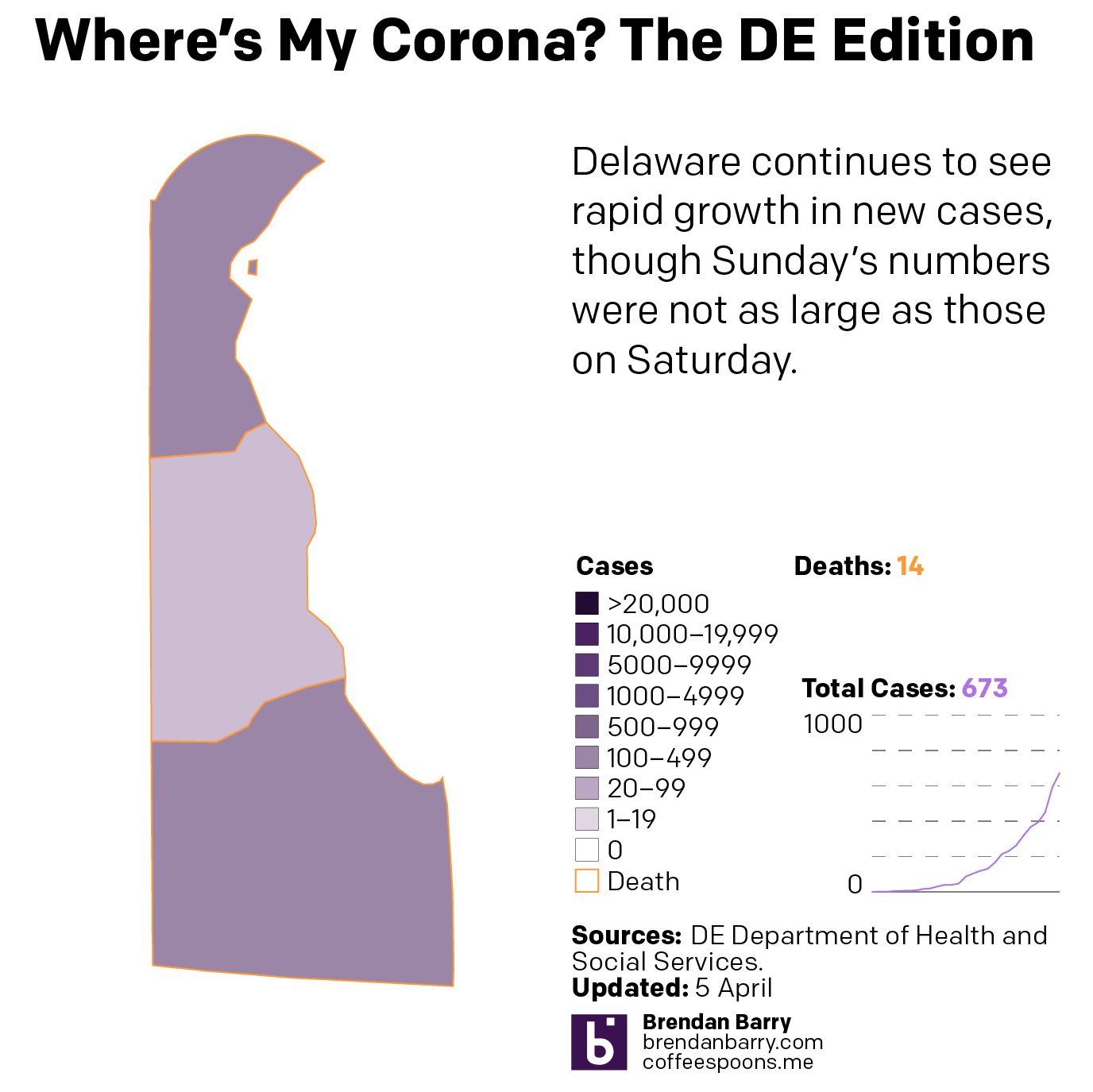
Delaware is the smallest state I look at—and one of the smallest in the union overall—but its cases are worryingly increasing rapidly, although like every state I examine in detail it had fewer new cases Sunday than Saturday.
The situation in Delaware
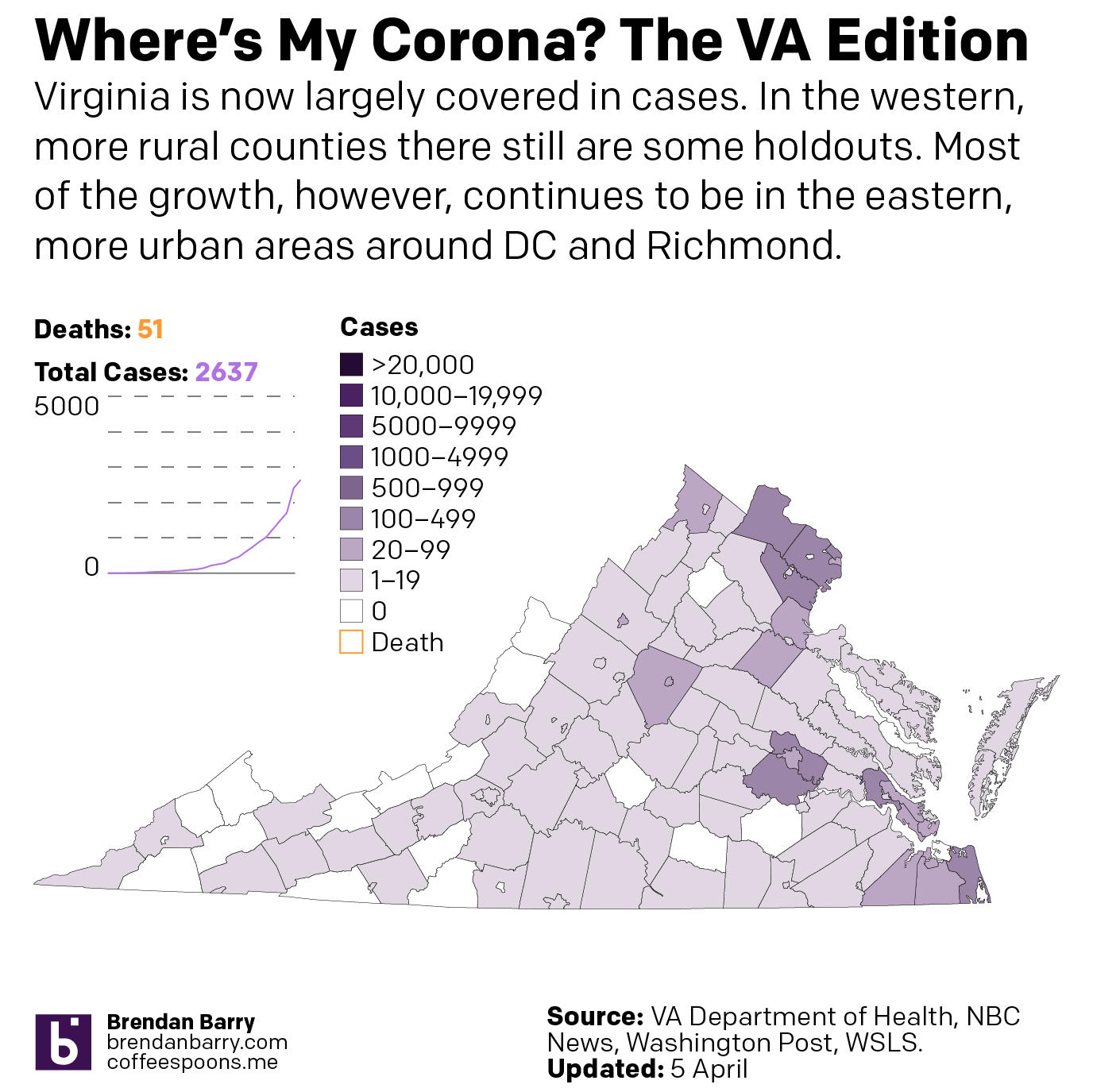
Virginia is in a better spot overall than the other four states. You can see that in the national map above. And most of Virginia’s cases are concentrated in the DC and Richmond areas as well as the cities along the peninsulas jutting into the Chesapeake.
The situation in Virginia
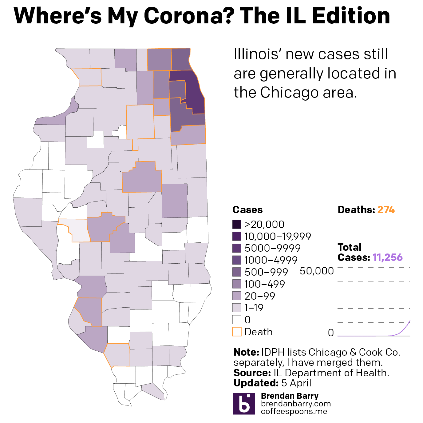
Illinois is, as noted above, similar to Pennsylvania in terms of infections. In terms of deaths, however, it is doubling Pennsylvania’s numbers. And most of its cases are located in and around Chicago. Big chunks of downstate Illinois are unaffected or lightly affected compared to the Commonwealth.
The situation in Illinois
Finally, as I noted in New Jersey, could these lower numbers Sunday than Saturday be meaningful? Possibly. But in all five states? Highly unlikely. Regardless, we can look at the number of daily new cases and see if that curve of infection is flattening. We should wait several days before beginning to make that assessment. But one can hope.
The case for flattening curves
All of this is to say that things are bad and likely will continue to get worse. But I will keep looking at the data daily and presenting it to the public to keep them informed.
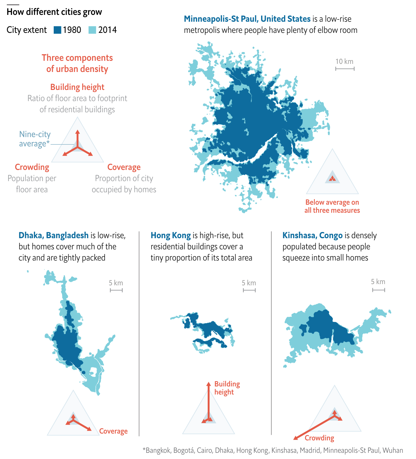
Yesterday we looked at the expansion of city footprints by sprawl, in modern years largely thanks to the automobile. Today, I want to go back to another article I’ve been saving for a wee bit. This one comes from the Economist, though it dates only back to the beginning of October.
This article looks at the different ways a city can achieve density. Usually one things of soaring skyscrapers, but there are other paths. For those interested, the article is a short read and I won’t cover it here. But for the sake of the graphic below, there are three basic paths: coverage, height, and crowding. Or to put in other terms, how much of the city is covered by homes, how tall those homes go, and how many people fit into each home.
Reticulating splines
I really like this graphic. It does a great job of using small multiples to compare and contrast three cities that exemplify the different paths. Notably, it keeps each city footprint at the same scale, making it easier to see things such as why Hong Kong builds skyward. Because it has little land. (It is, after all, an island and the tip of a peninsula.)
One area where I wish the graphic had kept to the small multiples is its display of Minneapolis. There, the scale shifts (note the lines for 5 km below vs. Minneapolis’ 10 km). I think I understand why, because the sprawling city would not have fit within the confines of the graphic, but that would have also hammered home the point of sprawl.
I should also point out that the article begins with a graphic I chose not to screenshot, but that I also really enjoy. It uses small multiples to compare cities density over time, running population on the x-axis and people per hectare on the y-. It is not a perfect graphic (it uses I think unnecessary arrowheads at the end of the line), but scatter plots over time are, I think, an underused graphic to show how two variables (ideally related) have moved in tandem over time.
Overall, this is a strong piece from the Economist.
Credit for the piece goes to the Economist graphics department.