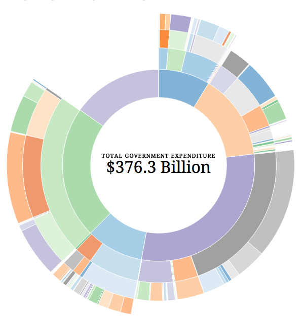
Visualising government budgets is always fun. Until you realise that you are seeing where your money is going. But now we look at Australia’s expenditures. And as I pay nothing in taxes to Australia, I get to keep my fun.

This piece is doing some interesting things within the framework of the donut chart I generally dislike. We do get to see the levels of detail for different departments or areas of spending. For example, one can see that costs for building Australia’s new destroyers and how that fits into the whole budget. Or, by clicking on a slice of the donut, one can zoom in to see how pieces fit at the selected level.
But the overall visual comparison of pieces and then identifying them through colour is less than ideal.
Found via the Guardian’s datablog, credit for the piece goes to Prosple and OzDocsOnline.
Leave a Reply
You must be logged in to post a comment.