Last Thursday, Facebook’s share price plunged on the news of some not so great numbers from the company on its quarterly earnings report. The data and number itself is not terribly surprising—it is a line chart. But what I loved is how the New York Times handled this on the front of the Business section on Friday morning.
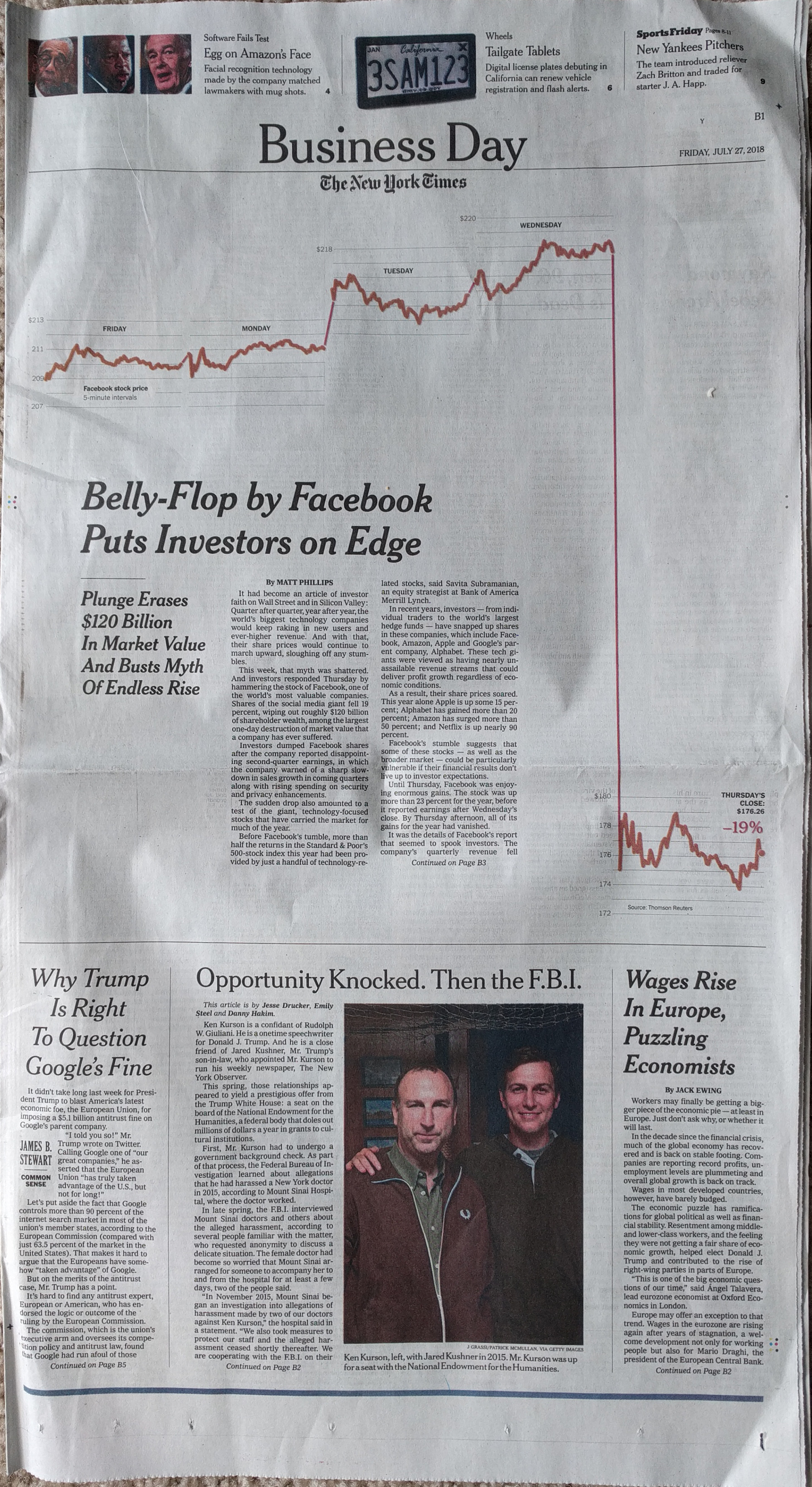
I found the layout of the page and that article striking. In particular, each day of the share price is almost self-contained in that the axis lines start and stop for each day. I question the thickness of the stroke as something a little thinner might have been a bit clearer on the data. However, it might also have not been strong enough to carry the attention at the top of the page. As it is, that attention is needed to draw the reader down the page and then down across the fold.
Additionally, the designers were sensitive to the need to draw that attention down the page. In order to do that they kept the white space around the graphic and kept the text to two small blocks before moving on to the interior of the section.
Credit for the story goes to Matthew Philips. Although I’m pretty sure the page layout goes to somebody else.
Leave a Reply
You must be logged in to post a comment.