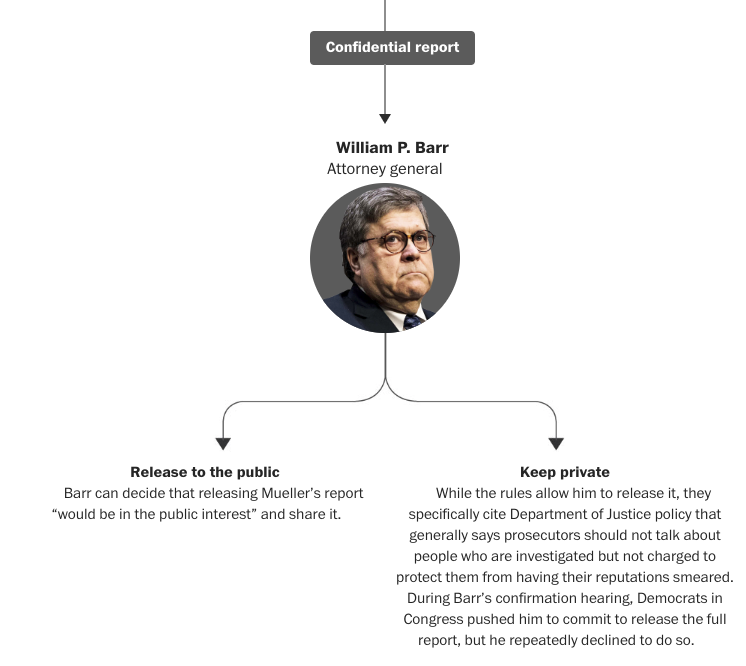
So today’s piece is not a revolutionary piece of information design, but it is fascinating. For two or so years now, we have all heard about the Robert Mueller investigation into potential contacts between the Trump campaign, early administration, and the administration of Russian president Vladimir Putin.
To be clear, thus far, this has been an incredibly productive special counsel.
34: the number of indictments
6: guilty pleas from associates of the Trump campaign
But what happens when the whole thing is done, especially since prevailing Justice Department rules state sitting presidents cannot be indicted? Well to answer that, we have this piece from the Washington Post.

Ultimately it is nothing more than a flow chart broken into pieces, separated by a textual narrative explaining the process. Now, I’m not certain how critical to the design each headshot is—especially Barr’s that looks especially frowny faced. However, the context in the above screenshot is crucial. The public does not necessarily have the right to the findings of the report if individuals in the report are not charged.
This means that design wise, we are looking at snippets of a larger chart interspersed with text. I would be interested to see the entire thing stitched together, but the textual breaks make a lot of sense. Overall, much like the sports pieces we looked at recently, this does a nice job of weaving textual story together with information design or data-driven content.
Credit for the piece goes to Dan Keating and Aaron Steckelberg.
Leave a Reply
You must be logged in to post a comment.