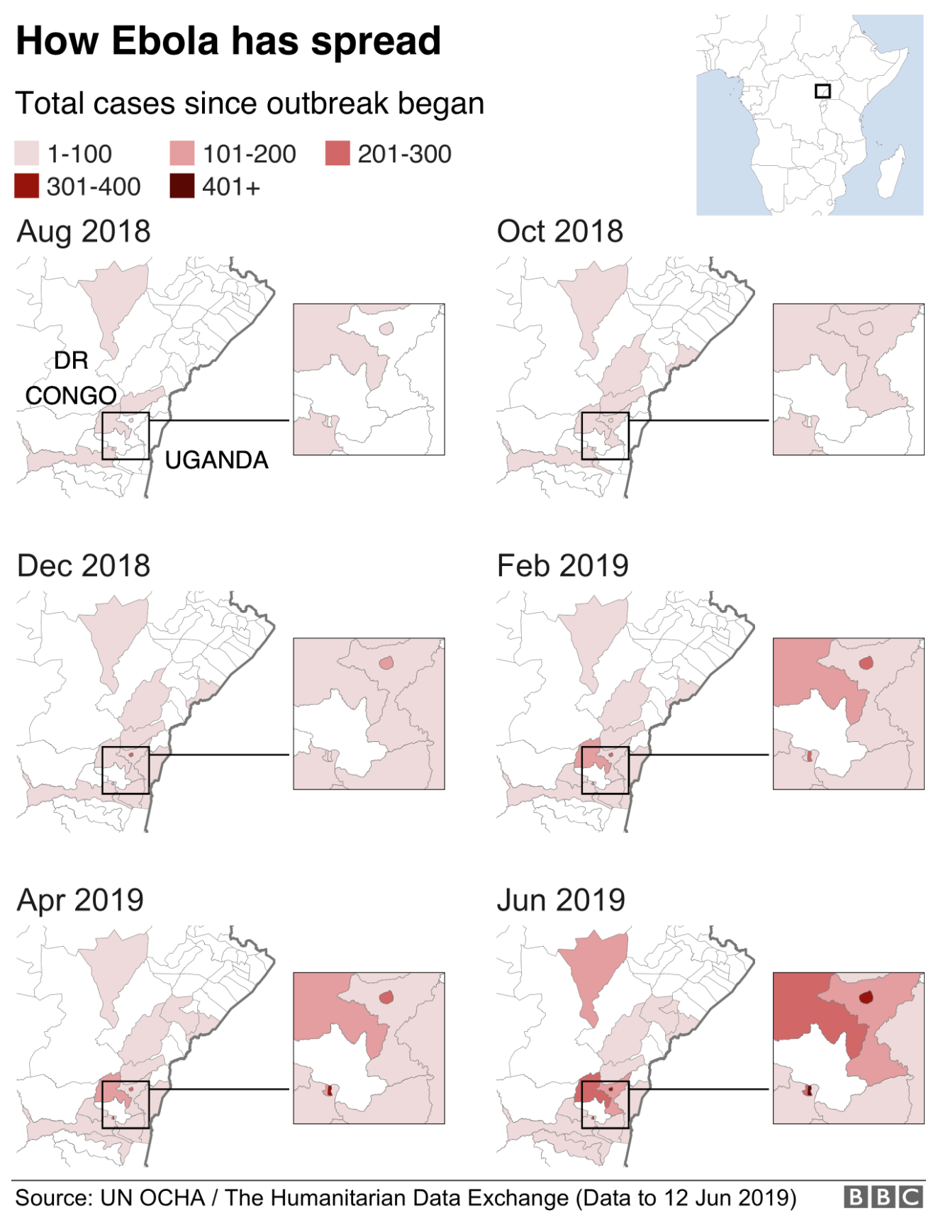
Ebola, which killed 11,000 people in West Africa in 2014 (which I covered in a couple of different posts), is back and this time ravaging the Congo region, specifically the Democratic Republic of the Congo (DRC). The BBC published an article looking at the outbreak, which at 1,400 deaths is still far short of the West Africa outbreak, but is still very significant.

The piece uses a small multiples of choropleths for western Congo. The map is effective, using white as the background for the no case districts. However, I wonder, would be more telling if it were cases per month? That would allow the user to see to where the outbreak is spreading as well as getting a sense of if the outbreak is accelerating or decelerating.
The rest of the article features four other graphics. One is a line chart that also looks at cumulative cases and deaths. And again, that makes it more difficult to see if the outbreak is slowing or speeding up. Another is how the virus works and then two are about dealing with the virus in terms of suits and the containment camps. But those are graphics the BBC has previously produced, one of which is in the above links.
Credit for the piece goes to the BBC graphics department.
Leave a Reply
You must be logged in to post a comment.