Here is a look at the data from Sunday’s releases on the COVID-19 outbreak in Pennsylvania, New Jersey, Virginia, and Illinois. I’ve omitted Delaware because they paused reporting on Sunday to move to a noontime release instead of their previous end-of-day.
I’m not exactly certain what that means for the data on Delaware and reporting time series. But, my guess is that will be more like a hole in the time series. I need to spend some time looking at that. But, anyways, on to the states for which we did have data on Sunday.
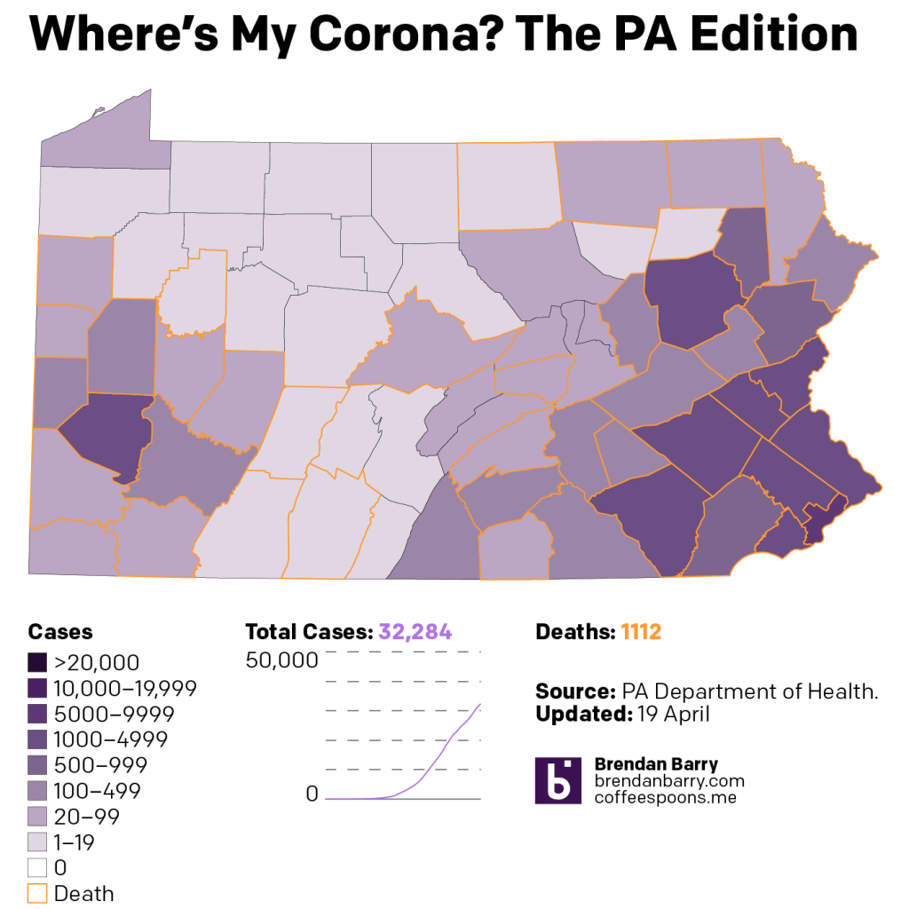
Pennsylvania continues to see growth in cases, but as we’ll get to with the levels, that appears to at least be stabilising. But in the spread of the outbreak, we are beginning to see the T of the state, that more rural and less densely populated area, beginning to fill in with cases. These are of course the areas of concern, the areas with shuttered rural hospitals, lack of comparatively developed infrastructure, where the impacts could be proportionately more severe than in the bigger cities. In terms of deaths, they have now spread almost across the state from east to west. I am still waiting until two adjacent counties connect before I make that final pronouncement.
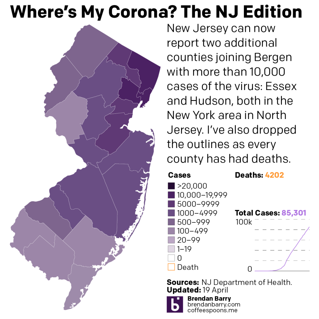
For New Jersey, I have removed the orange outlines around each county. The initial idea was to show where deaths had occurred. But now that they have been reported in every county, they don’t seem to be as helpful as the small number I provide in the graphic. Regardless, 4200 deaths is a lot. But the approximately 200 new deaths is the lowest number reported in several days.
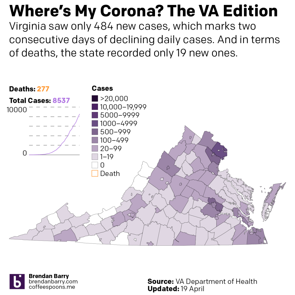
Virginia is a weird state. When we see the levels chart below, you will see how its uptick has been far more gradual, and to this point it does not yet appear to have peaked or begun to stabilise. Most of the reported cases continue to be in and around the state’s big cities, notably the DC metro area, but also Richmond.
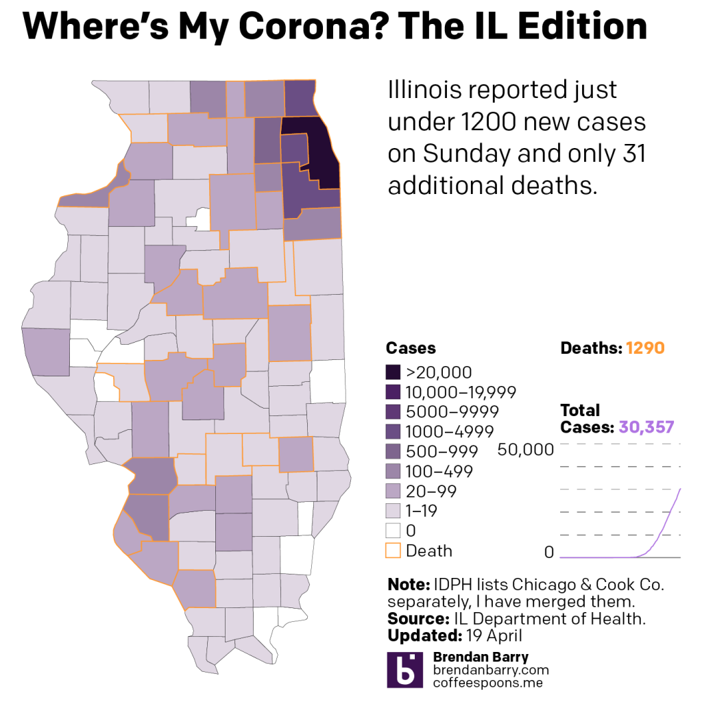
Illinois has now seen cases from north at the Wisconsin border all the way south to Cairo. Most cases remain, however, concentrated in the Chicago metropolitan area, with lesser scale outbreaks occurring in the Quad Cities area and the suburban counties of Illinois this side of the Mississippi. Deaths continue to rise, and while most area again in the Chicago area, they are appearing increasingly at low levels in downstate counties.
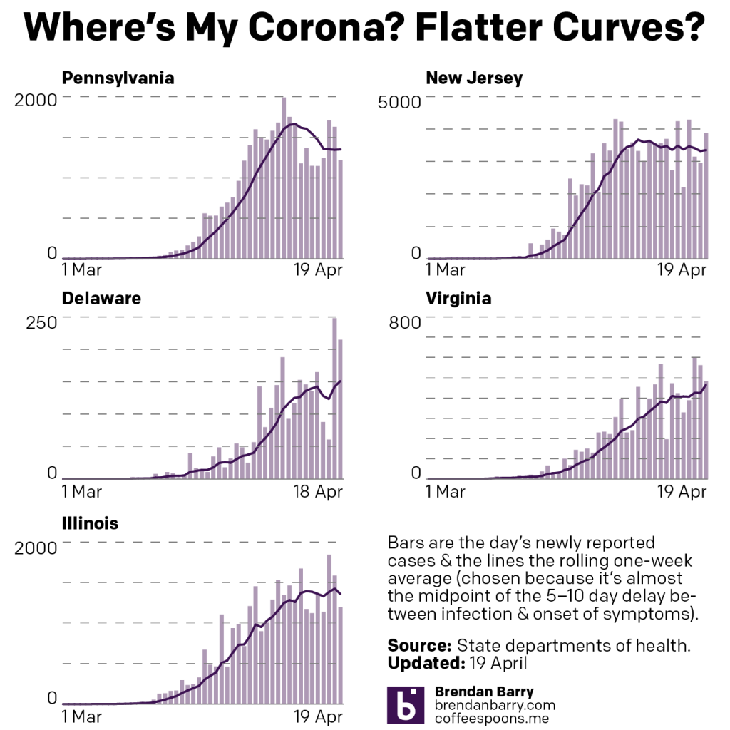
But what about those curves? Excepting Delaware, which hasn’t reported new data, we can see that some states like Virginia continue to see increasing rates of infection. Others like New Jersey and Pennsylvania clearly have flattened and have entered a new phase. In New Jersey’s case it appears to be more of a stabilised plateau. In Pennsylvania, there was some evidence it was entering a declining rate phase, but that may now have begun to become more of a steady rate of infection like in New Jersey. Illinois is tough to read because of the variability of its data. It might be more of a pause in the rate of increase, or it may have begun to stabilise. We need more data.
Credit for the pieces is mine.
Leave a Reply
You must be logged in to post a comment.