Another day, more cases of coronavirus and Covid-19. So let’s take a look at Sunday’s data as there were some interesting things going on.
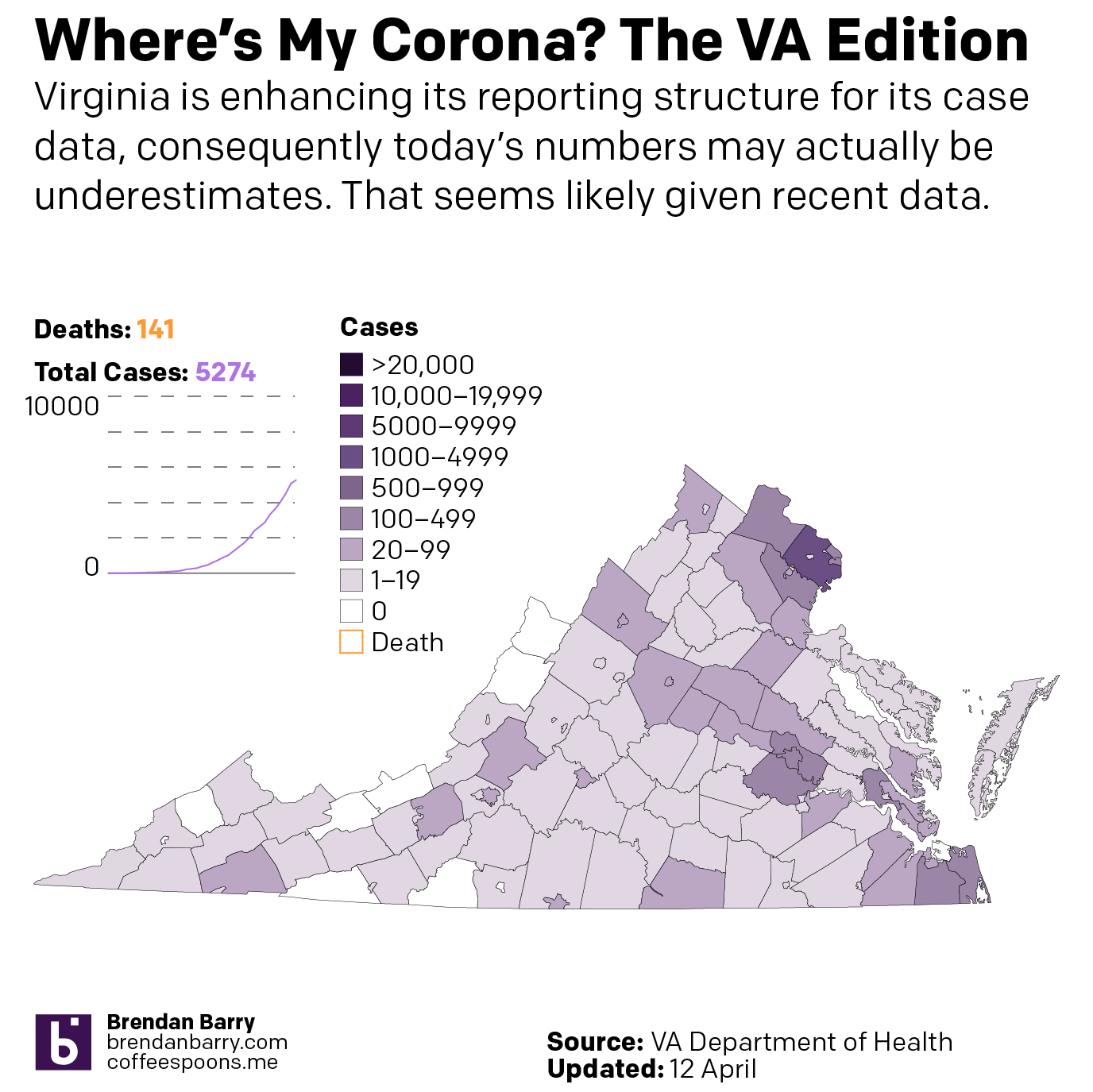
First, let’s dispense with Virginia. The state is enhancing its reporting structure, and so they admit the data is likely an underestimate of the present situation in Virginia. So here’s Virginia, nothing really changed.
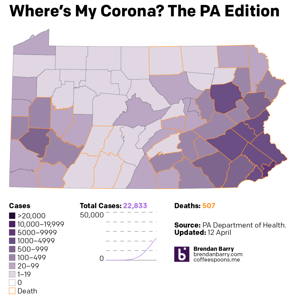
Moving on, we have Pennsylvania. Here we are beginning to truly see the disparity between the cities in the southeast and southwest, namely Philadelphia and Pittsburgh, and the T that describes what sometimes is used to describe Pennsyltucky. (Though it also includes cities like Harrisburg, the state capital.) The point is that the T of Pennsylvania has yet to suffer greatly from the outbreak. Of course, it’s also the part of the state least equipped to deal with a pandemic.
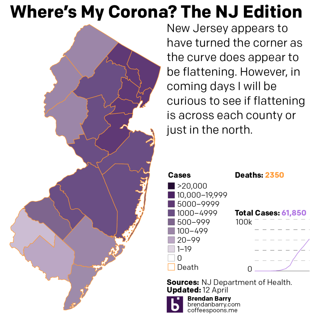
New Jersey is just bad. One can make the argument that South Jersey is hanging on. (Though I will touch on that later with an idea for today’s afterwork work.) Bergen County in the northeast is likely to surpass 10,000 cases on its own today. And that will put it above most states.
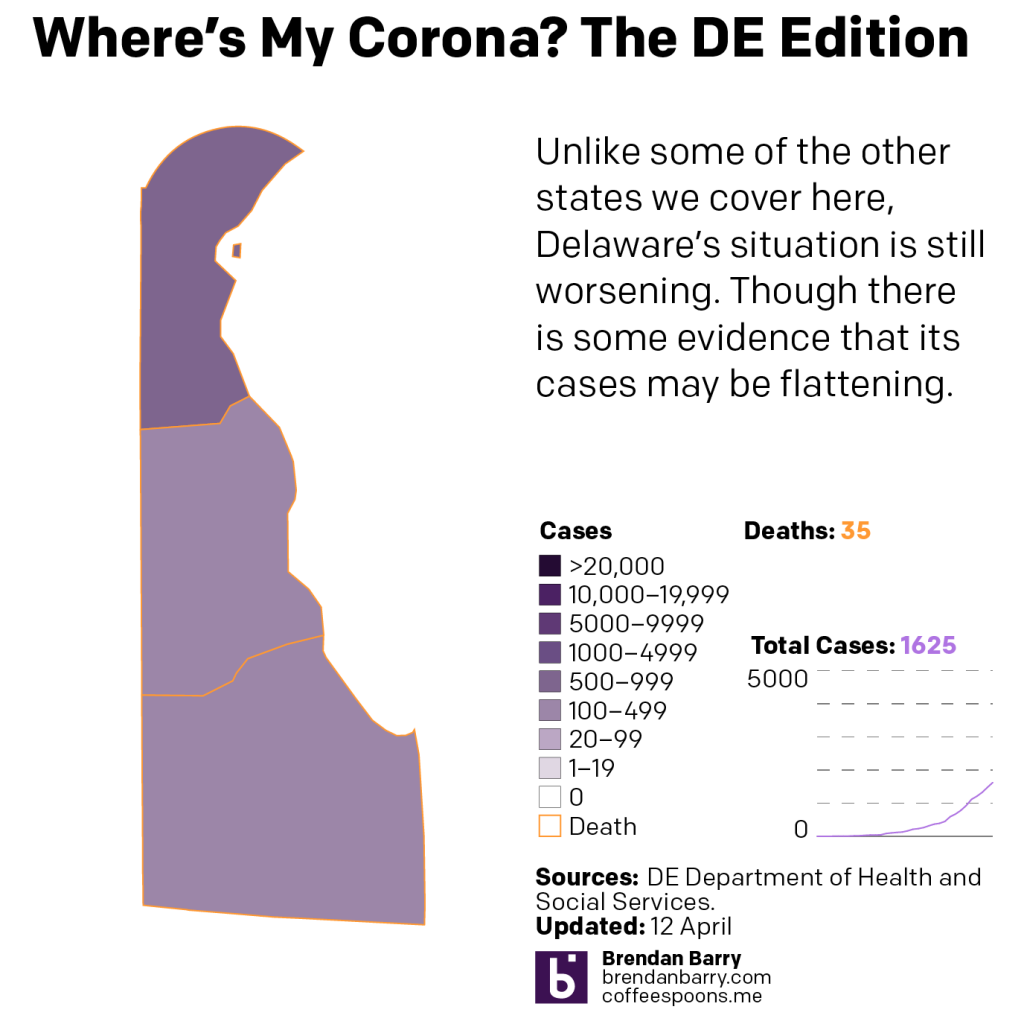
Delaware is tough because it sits as a small state next to several much larger ones. But, the numbers seem to indicate the outbreak is still worsening. Though in terms of geographic spread, there’s little to say other than that New Castle County, home to Wilmington, in the north is the heart of the state’s outbreak.
Illinois is a fascinating state, because of how dissimilar it is compared to Pennsylvania, a state which has a similar number of people.
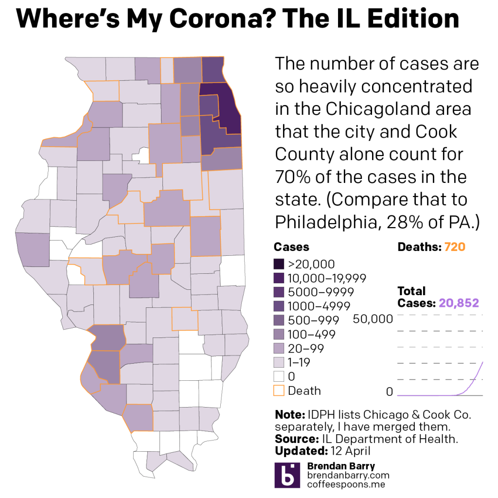
The map shows that geographic spread still has a little way to go before reaching every county in the state. But the outbreak has been there longer than in Pennsylvania. And most of the darker purples are concentrated in the northeast, in Chicago and its collar counties. Compare that to Pennsylvania above where you will see dark purple scattered across the cities of its eastern third, e.g. Allentown and Scranton, and in the western parts near Pittsburgh. This too could be worth exploring in depth in the future.
Lastly I want to get to the cases curves charts. Here we look at the daily new cases in each state.
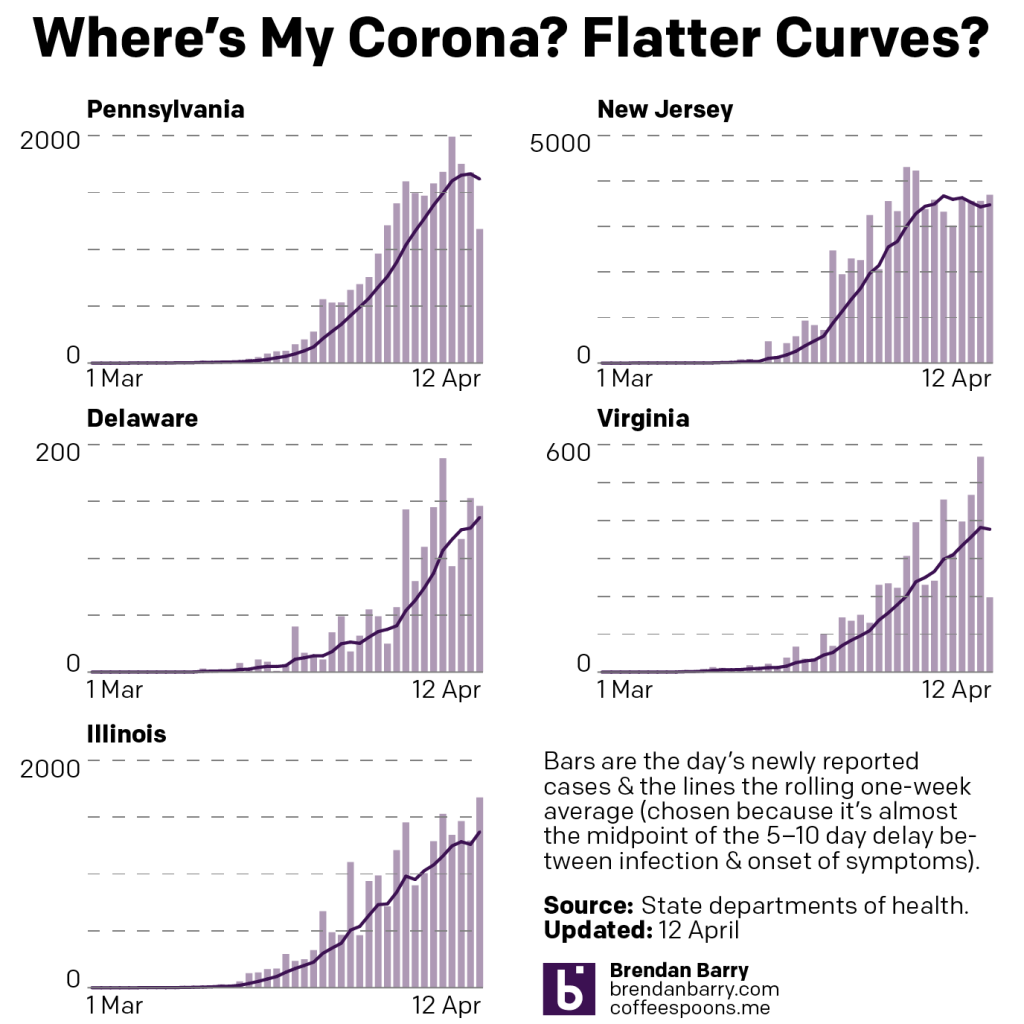
And unfortunately Sunday’s numbers will impact the Virginia curve, but it overall looks as if the state is worsening. I would argue that Illinois, which appears to be bending towards a steadying condition is likely in a weird weekly pattern where it appears to stabilise on weekends and then resumes reported infections come Monday. Pennsylvania might well be flattening its curve. I would want to see a few more days’ worth of data before stating that more definitively. Let’s give it to Wednesday or Thursday.
And then in New Jersey we have a fascinating trend. The curve of increasing number of cases has clearly broken. But it also is not shrinking. Instead, it seems to be more of a plateau. And in that case, the outbreak in New Jersey is not getting worse, but it’s also not getting any better. At least not numerically. However, the goal of flattening the curve is to create a slower, more steady increase in case numbers to help hospitals cope with surge volumes. So good news?
Credit for the pieces is mine.
Leave a Reply
You must be logged in to post a comment.