
The United States surpassed 500,000 deaths from Covid-19. On Sunday, in advance of that sobering statistic, the New York Times published a front-page graphic that dominated the layout.
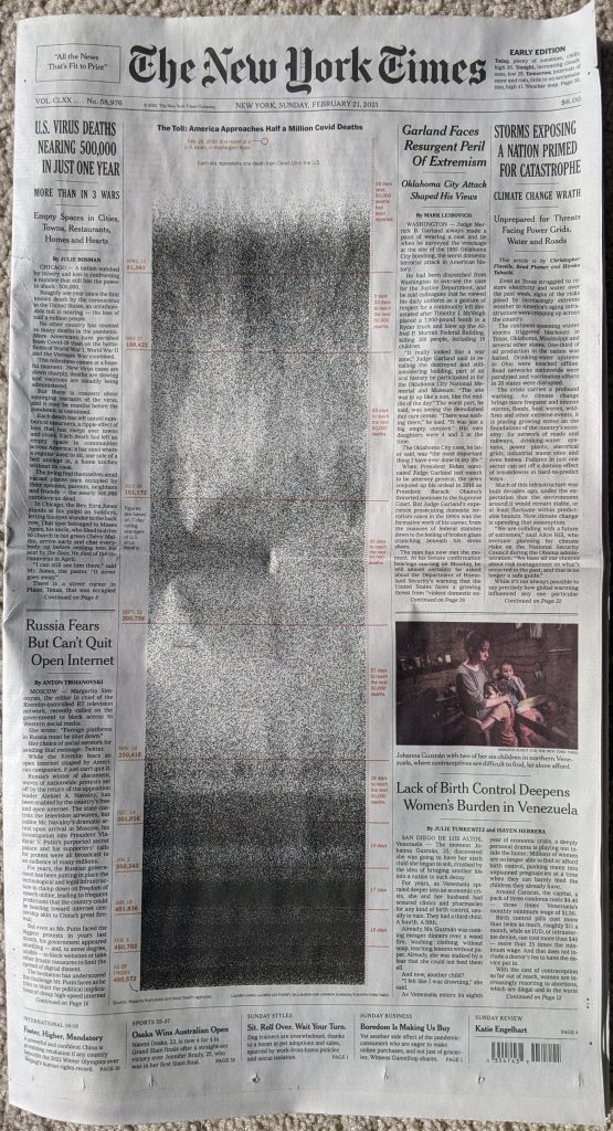
Usually a front-page graphic will make use of the four-colour process and present richly coloured graphics. This, however, starkly lays out the timeline of deaths in the United States in black and white.
Meaningful graphics do not need to reinvent the wheel. This takes each life lost as a black dot and then, starting at the top in February, plots each day.
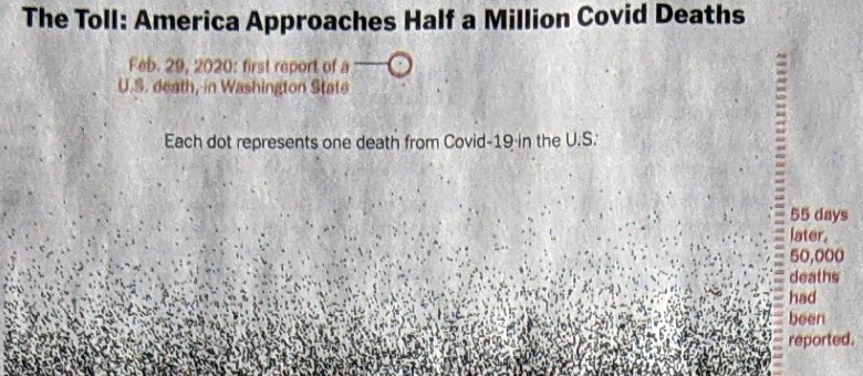
The colour here serves as the annotation. The red circle drawing attention to the first reported death. And down the side the tick marks for days. Red lines indicate 50,000 death increments. The labels tell the story, we’ve needed fewer and fewer days to reach each subsequent 50,000 milestone.
As the first wave intensifies in March and April, the space fills with black dots. But as we enter summer and deaths fell, the space lightens. Late autumn and winter bring more death and you can see clearly towards the bottom of the chart, as we approach today, the graphic is nearly solid black.
If we want to look towards a hopeful point in the content, we can see first that it took 17 days then 15 to reach 400,00 deaths and 450,000 deaths, respectively. But it took 19 days to reach 500,000. As a nation we appear to finally be on the downward slope of this wave.
Returning to the piece, it’s a gut punch of simplicity in design.
Credit for the piece goes to Lazaro Gambio, Lauren Leatherby, Bill Marsh, and Andrew Sondern.
One thought on “500,000 Deaths”