Today’s piece is another piece set against a black background. Today we look at one on natural disasters, created by both weather and geography/geology alike.
The Washington Post mapped a number of different disaster types: flooding, temperature, fire, lightning, earthquakes, &c. and plotted them geographically. Pretty clear patterns emerge pretty quickly. I was torn between which screenshots to share, but ultimately I decided on this one of temperature. (The earthquake and volcano graphic was a very near second.)
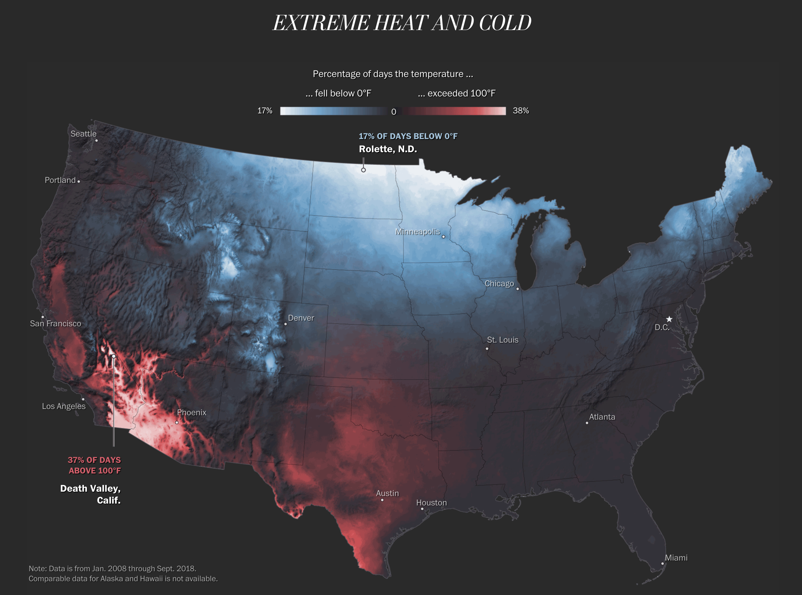
It isn’t complicated. Colder temperatures are in a cool blue and warmer temperatures in a warm red. The brighter the respective colour, the more intense the extreme temperatures. As you all know, I am averse to warm weather and so I will naturally default to living somewhere in the upper Midwest or maybe Maine. It is pretty clear that I will not really countenance moving to the desert southwest or Texas. But places such as Philadelphia, New York, and Washington are squarely in the blacked out or at least very dark grey range of, not super bad.
Credit for the piece goes to Tim Meko.
Leave a Reply
You must be logged in to post a comment.