After looking this week at the growth of the physical size of cities due to improvements in transport technologies, the increasing density of cities, and then the contribution of automobile (especially personal cars) to carbon dioxide emissions, today we look at a piece from the Transport Politic comparing US and French mass transit ridership to see whether the recent decline in US ridership is inevitable or a choice made by consumers and policymakers. Spoiler: it’s not inevitable.
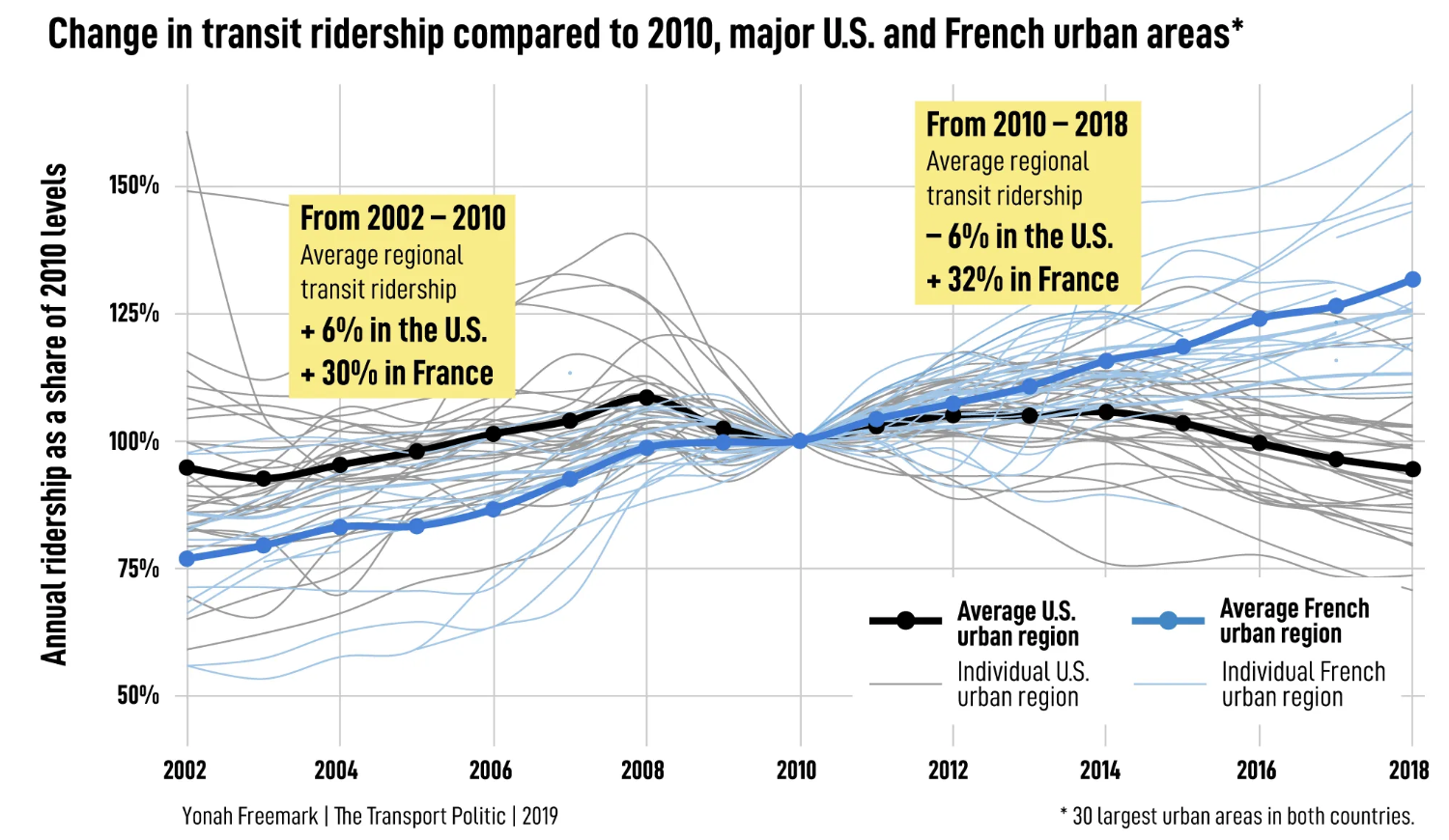
The article makes use of a few graphics and an interactive component. The lead-in graphic is a nice line chart that runs with the spaghetti nature of the graphic: lots of line but only two are really highlighted.

Light grey lines and light blue lines encode the US and French cities under study. But only the lines representing the averages of both the US and France are darkly coloured and in a thicker stroke to stand out from the rest. Normally I would not prefer the minimum of the y-axis being 50%, but here the baseline is actually 100% so the chart really works well. And interestingly it shows that prior to the Great Recession, the United States was doing better than France in adoption of mass transit, relative to 2010 numbers.
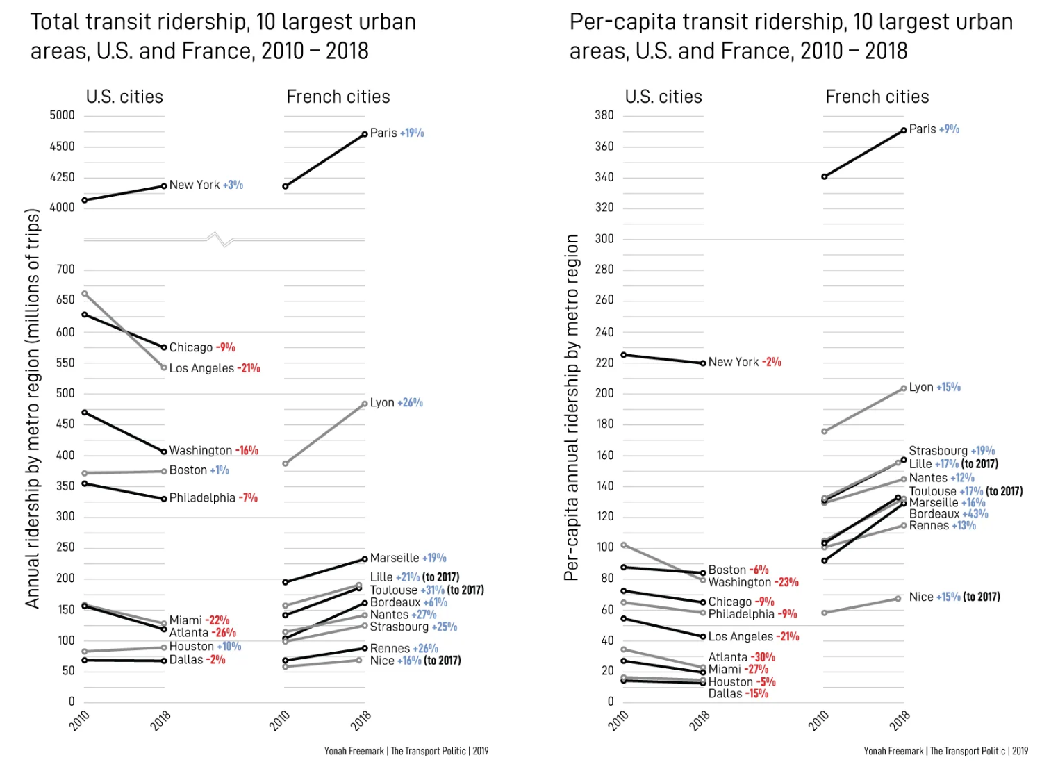
But then when you directly compare 2010 to 2018 for various US and French cities, you get an even better chart. Also you see that French cities reclaim the lead in transit growth.

These two static graphics, which can each be clicked to view larger, do a really great job of cutting through what some might call noise of the intervening years. I do like, much like yesterday’s post, the comparison of total or aggregate ridership to per capita numbers. It shows how even though New York’s total ridership has increased, the population has increased faster than the ridership numbers and so per capita ridership has declined. And of course as yesterday’s post examined, in the States the key to fighting climate change is reducing the number of people driving.
What I cannot quite figure out from the graphic is what the colouration of the lines mean. I thought that perhaps the black vs. grey lines meant the largest cities, but then LA would be black. Maybe for the steepest declines, but no, because both LA and Boston are grey. I also thought the grey lines might be used when black lines overlap to aid clarity, but then why is Boston in grey? Regardless, I like the choice of the overall form.
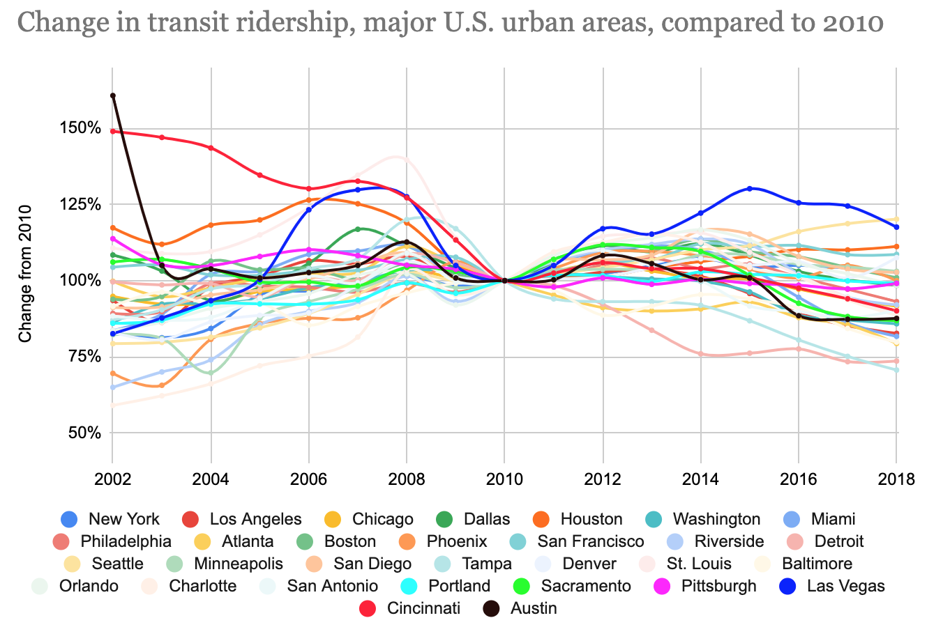
But where things go really downhill are the interactive charts.

Talk about unintelligible spaghetti charts. So the good. The designer kept the baseline at 100% and set the min and max around that. After that it’s a mess. Even if the colours all default to the rainbow, the ability to select and isolate a particular city would be incredibly valuable to the user. Unfortunately selecting a city does no such thing. All the other cities remain coloured, and sometimes layered atop the selected city.
I would have thrown the unselected cities into the greyscale and let the selected city rise to the top layer and remain in its colour. Let it be the focus of the user’s attention.
Or the designer could have kept to the idea in the first graphic and coloured American cities grey and French cities light blue and then let the user select one from among the set and compare that to the overall greyed/blued masses and the US and French averages.
Overall, it wasn’t a bad piece. But that final interactive bit was questionable. Unfortunately the piece started strong and ended weak, when the reverse would have been preferable.
Credit for the piece goes to Yonah Freemark.
Leave a Reply
You must be logged in to post a comment.