Last week we saw that in the weeks after Christmas, new cases and deaths rebounded in the five states of Pennsylvania, New Jersey, Delaware, Virginia, and Illinois. The question was how bad would things continue to get? Would these rebounds sustain themselves?
A week later we can see a glimmer of good news in that with new cases, these rebounds appear to have crested and are now ebbing back down. At least in four states.
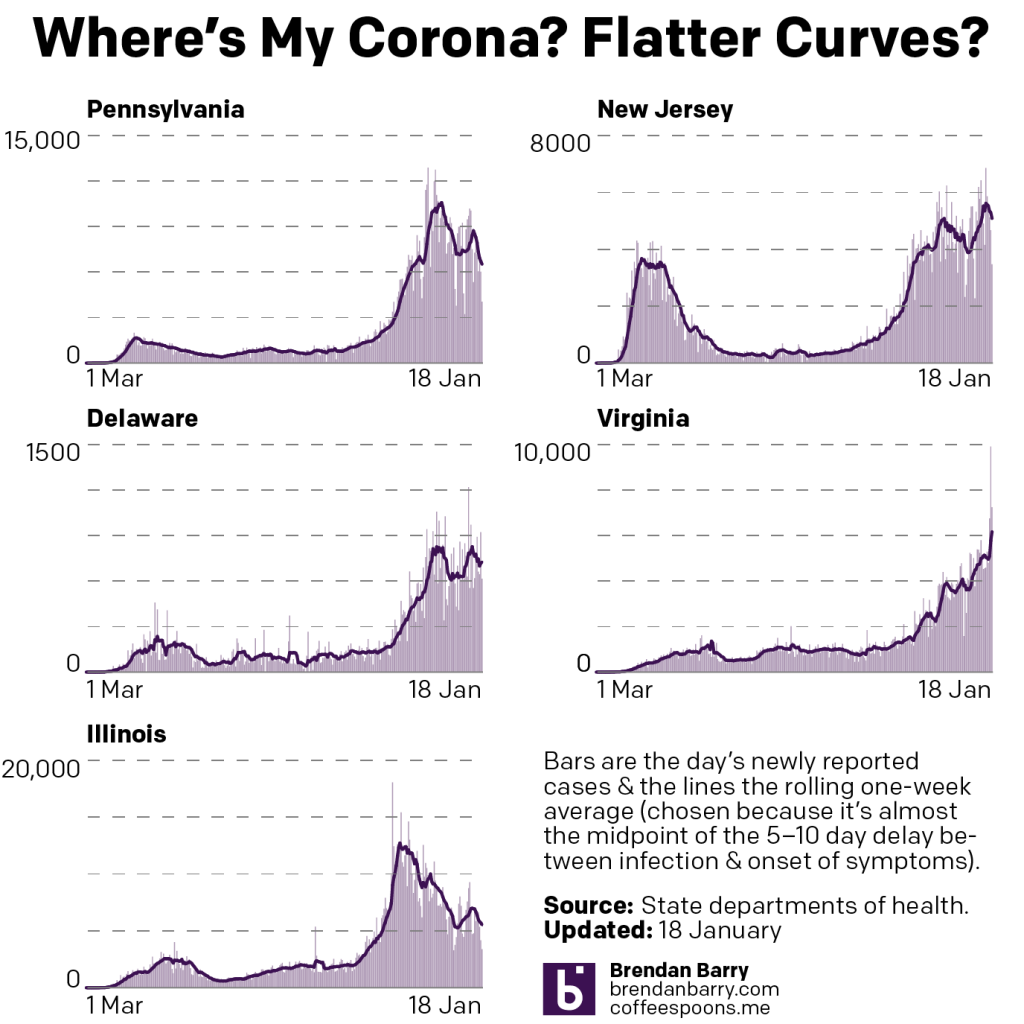
In Virginia, unfortunately, we see that new cases continue to climb with a new record of nearly 10,000 cases reported late last week. More broadly, this is the dilemma that confronts the United States. We have states like Pennsylvania, Delaware, and Illinois where we are bringing the virus back to heel. But in other states like Virginia, things continue to get worse.
New Jersey is somewhere in the middle. It appears to just possibly be cresting with its average actually ticking higher the last few days despite falling daily new cases. We will need to see how the Garden State plays out over the course of this week.
When we look at deaths, we continue to see the grim numbers pile up.
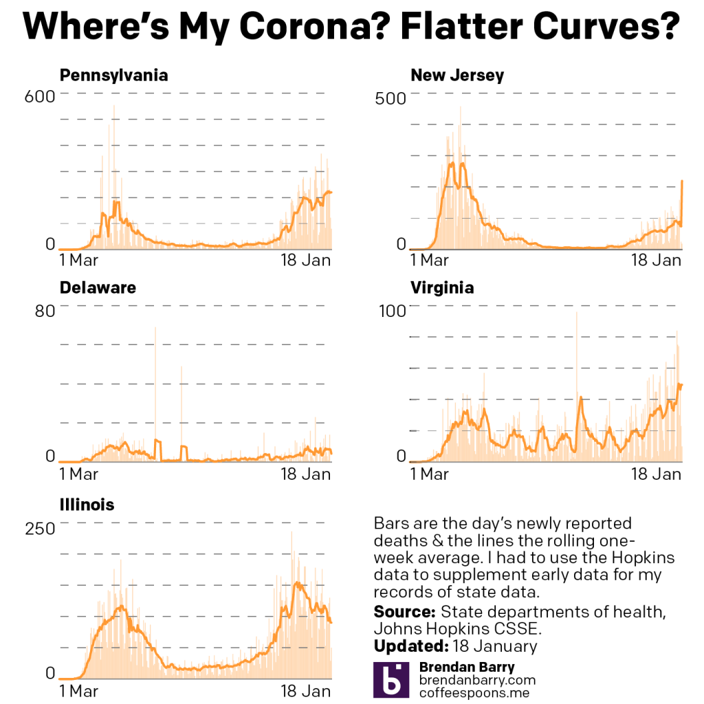
Deaths, of course, lag new cases by 2–4 weeks, sometimes as many as six or longer. In most of our five states, the average rate of deaths appears to be cresting or peaking. In Pennsylvania the curve may have peaked. In Delaware, we have seen a plateau and in Illinois we see the best news of a resumed decline.
In both New Jersey and Virginia, however, we see deaths continuing to climb, and in some cases by significant amounts.
If cases really have peaked in some of these states over the last week, we may expect deaths to continue to rise over the course of this week before beginning to fall again.
I also want to add two new graphics today. I have been trying to figure out how to cover the vaccination programme of the five states. Unfortunately, they do not all report the same data in the same way.
The graphic that perhaps makes the most sense is the one that looks the emptiest at the moment.
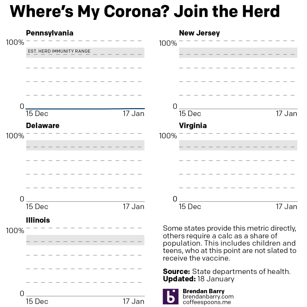
In order to resume “normal” lives, we need to achieve herd immunity. When we reach that level, the virus starves of new hosts and dies out. Broadly speaking, we have two ways of achieving herd immunity.
Option 1, let the virus run rampant and takes its course through the population. The benefit is that society remains open and people can return to cafes, pubs, shops, and museums. The cost is that millions get sick and hundreds of thousands die. Sadly, this is the route taken by Sweden and, unofficially, the United States.
Option 2, vaccinate the population. The benefit here is that millions do not get sick and hundreds of thousands do not die. The cost is that in order to wait for a vaccine and vaccination we would need to close cafes, pubs, shops, and museums.
The reality is that we chose something between the two. In the initial months, after we (belatedly) recognised the threat of the virus, we shut down our economies and stayed home. We chose option 2. You can see in the state charts above how that quickly helped us curb the spread of new infections.
Unfortunately, then the Trump administration chose to follow option 1 and encouraged states to “reopen” their economies. And because we never got the virus fully under control, we sowed the seeds for the explosive growth this autumn and winter.
But the vaccines are now here and the best bet is to vaccinate the population. How many people do we need to vaccinate? The exact number depends upon the infectiousness of the virus. Measles, one of the most infectious viruses out there, requires near 100% vaccination rates to achieve herd immunity. Thankfully, this coronavirus is not as infectious as measles. Early estimates placed the range at 60–70%. But lately, some epidemiologists have indicated the true number may be higher. Dr. Fauci of the National Institutes of Health (NIH) has said the true number is likely 70–85%.
This is why the new strains of the coronavirus we have identified in South Africa and the United Kingdom worry folks. Both appear to be more transmissible than earlier strains. Neither strain appears to be more lethal in its own right—although more cases means more people will die—but this increased infectiousness could mean we need an ever higher level of herd immunity, which means more vaccinations. And we’re already seeing the anti-vaccination support rising to somewhere in the range of 15-20%, just the threshold we could perhaps tolerate with the higher herd immunity range.
So what about the chart?
As we begin vaccinations, some states are reporting the numbers of people in their state that have been fully vaccinated against the coronavirus. I plot those numbers here. Pennsylvania, Virginia, and Illinois do so. Unfortunately, neither New Jersey nor Delaware does. I only have one data point recorded for Virginia and Illinois, and so they are not plotted yet, but both fall below the level of Pennsylvania, which has reported 0.50% of its population fully vaccinated. I have added a bar to show the range of estimated herd immunity we need.
And that gets us to the second new chart, the number of total doses administered per day.
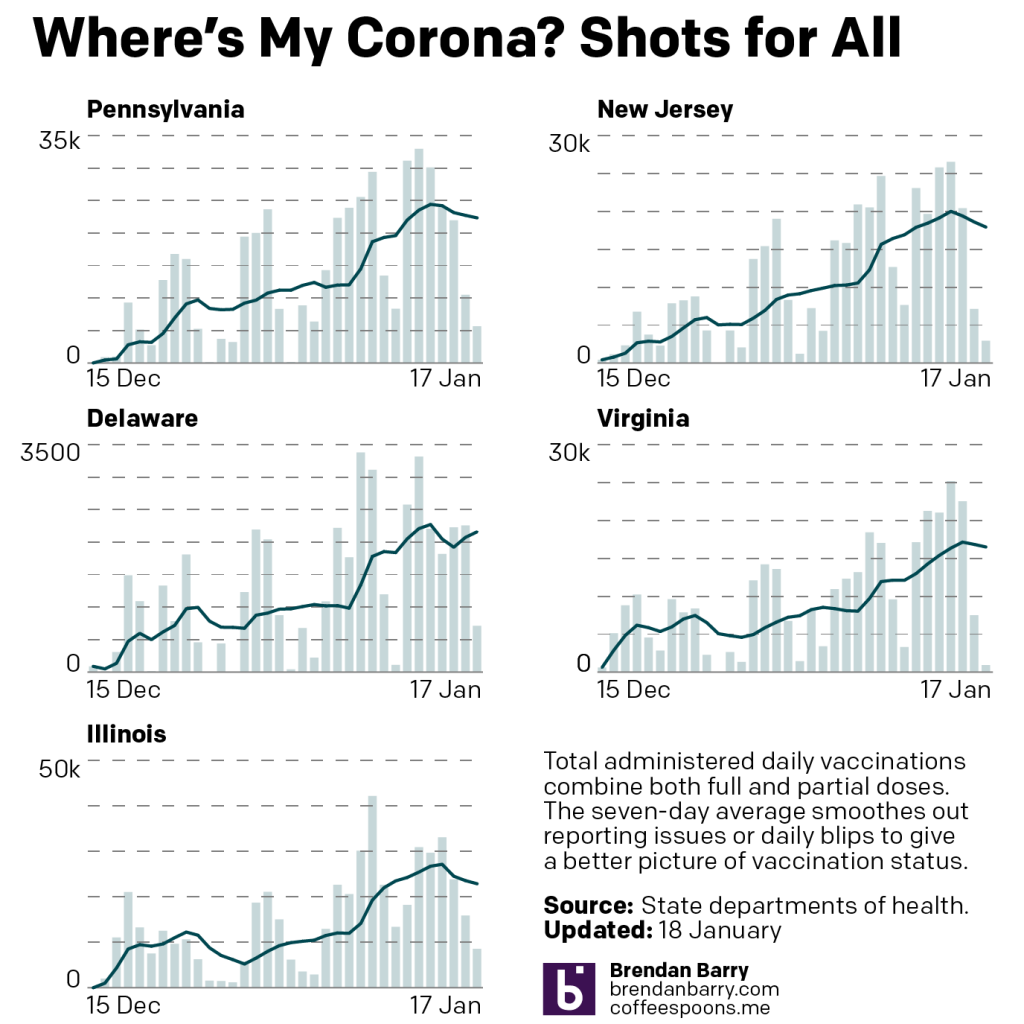
Functionally this resembles the usual two charts. We track the number of doses administered daily and then plot their seven-day average to smooth out any day-to-day blips. Of course this means almost the opposite of those two charts as we are tracking the progress of people who will be immune from the virus.
The catch is that with the current vaccines we need two shots for a full course of treatment and not all states break the data down with that level of granularity. Again, we are looking at Delaware and New Jersey as they provide only the total number of doses administered. Now that’s still helpful, but it doesn’t give us the most accurate picture of what is happening with vaccinations.
But in order to make things comparable across five states, I have decided to use that broader, total doses administered metric for Pennsylvania, Virginia, and Illinois. (Virginia and Illinois provide another headache in that it reports the daily number of people fully vaccinated, but does not break down the number of full vaccination doses.)
So what is this second chart showing us?
Well, we are seeing a slow, nearly steady growth in the number of vaccines administered. The problem is that we need to see steep, nearly exponential line charts here if we want to have any hope of returning to “normal” anytime soon. Reporting tells us that the federal government’s approach to the logistics of vaccine distribution has been…not great. (Although at this point, perhaps that should not surprise us.)
Until we see these second charts begin to show more exponential growth, the first charts of the number of people fully vaccinated will be far below that herd immunity threshold we need to see.
Covering the vaccines in addition to the virus is a bit more work, but I’m going to try and cover them both over the next several months as I have with the outbreak itself.
Credit for the piece is mine.
Leave a Reply
You must be logged in to post a comment.