The middle third of the United States sits under some pretty cold Arctic air, helping to bring frozen precipitation, i.e. snow, to places unfamiliar with it, most notably Texas. I say unfamiliar, but Texas is also negligently unprepared. There are photos circulating the internet of Texarkana, a city straddling the Texas–Arkansas border, of the Arkansas side plowed and safe for travel whilst the Texas side…is not. You also have a deregulated and privatised energy grid, which has seen wholesale prices spike to $9,000 per megawatt hour. (Some companies in the Texan market charge wholesale rates to their customers, so I wouldn’t be surprised to see stories coming out in the next few weeks of excessively large electric bills.)
What’s driving this Texas-scale cold? Why is Arctic air over Dallas? In years past you’ve probably heard the term “polar vortex”. The super simple version is that really cold air spins in a tight upper-atmosphere vortex over the pole, hence the name. But when the vortex weakens, say due to warmer air, it becomes a bit more unstable. When it becomes unstable, a chunk of it might break off and descend south. It doesn’t always descend over continental North America, but when it does… well, since the mid 2010s we’ve been calling it the polar vortex. Keep in mind, that it’s not, it’s a part of an upper-level low whose cold air eventually falls to the surface, but despite my protestations, the name has stuck.
Anyway, it means we presently are witnessing some frigid temperatures across the US and this graphic from the National Weather Service (NWS) highlights just how extreme those temperatures are.
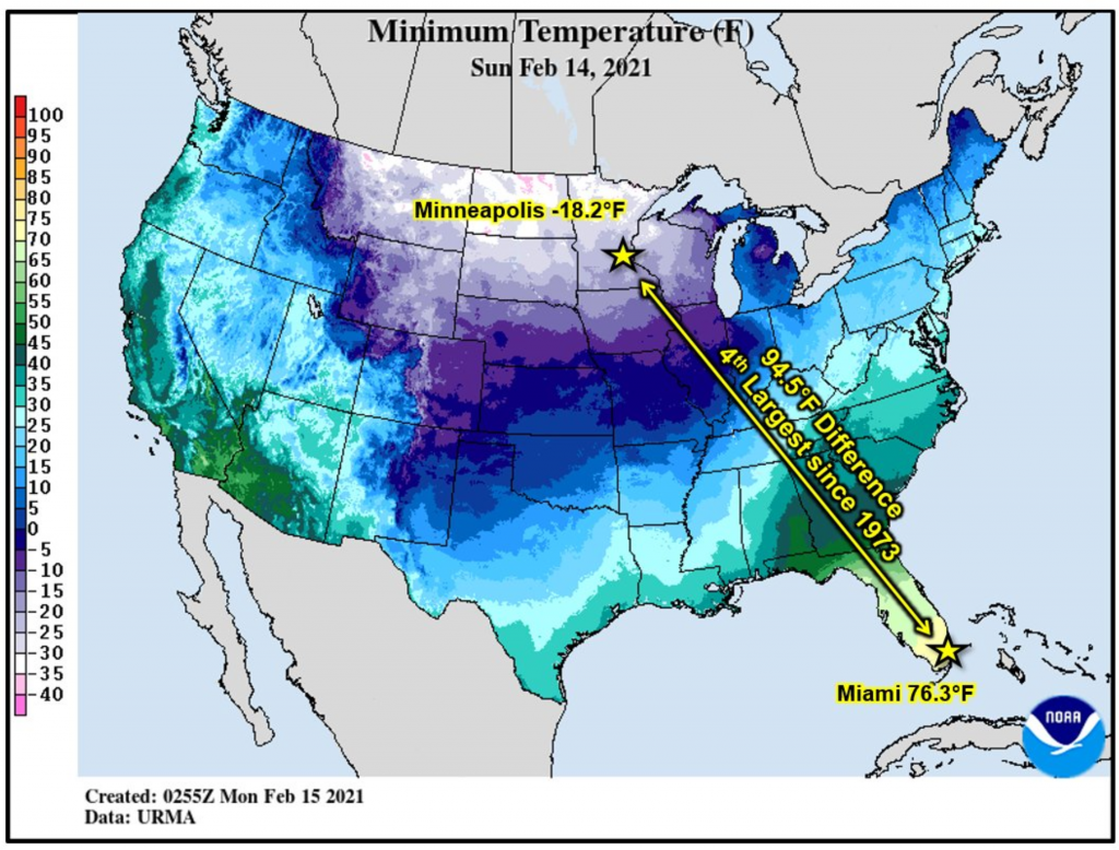
The distance is no surprise here, because in winter one would expect Minneapolis and Miami to exhibit extreme temperature differences. But it’s the scale of this difference that is so dramatic.
I could probably do a whole piece—or several—about the design of NWS graphics, but I’ll just point out that I’d probably lighten the black lines working as state/provincial borders. And while their colours are standardised, I wonder if making a clearer distinction between freezing and above freezing (32ºF in this map) would make some more sense.
Credit for the piece goes to the NWS.
Leave a Reply
You must be logged in to post a comment.