What Will You Have

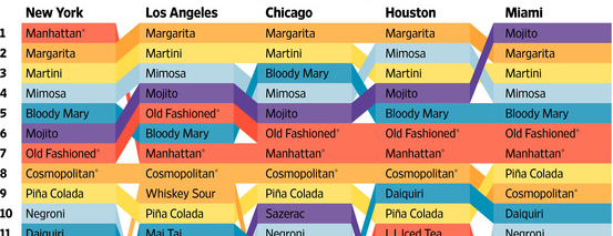
Now that it’s Friday, it’s time for happy hour drinks. Well, maybe not quite yet. Let’s get through the workday first. But over at the Wall Street Journal, together with Yep, they looked at which cocktails are most popular in eight cities based on Yelp reviews. They do note that the metric is not perfect as people will complain about Manhattan in a New York bar review but not actually drink a Manhattan. But, honestly, when you’ve had a few cocktails, the maths are bound to get a bit fuzzy.

A cropping for the top ten in half the cities

Of course the next step would be to make an interactive version with links to recipes. And from the visualisation side, you could cluster the data by drink bases. And no, the martini should not start with vodka. Come on, people, you use gin.

Credit for the piece goes to Rani Molla.

Baseball’s Pace of Play and ESPN’s Pie in Their Face

Baseball is my sport. I love it. Some of my favourite games are the four-hour long matches between my Red Sox and the scourge of the Earth, the Yankees. Games can take a long time for a number of reasons. But in an increasingly fast-paced world, critics argue that younger generations do not have the patience for even three-hour games. So Major League Baseball this year is actively trying to reduce the time of games through pace-of-play improvements. To do this, they are looking at and collecting more of baseball’s copious amounts of data.

Unfortunately, ESPN in an article about the improvements for this year took the data and did nothing with it.

For the love of god, why?

Above we have survey results. I want to vomit in my mouth. Wait, hold on…sorry about that, I am back now. Some organisations have done some really nice visualisations with baseball data, of which we have a lot because the sport plays 162 games per year. We surely could be looking at more timing data. But, instead we get three-dimensional pie charts from ESPN. The rest of the article is not much better, though their styling of bar charts still leaves things to be desired.

Credit for the piece goes to ESPN’s graphics department.

Sex, Drugs, and Rock Oil

North Dakota’s economy has been booming because of shale oil. Most of that economic growth has been centred on what was the small city of Williston, North Dakota. Economic growth often leads to population growth, however, and that can at times lead to growth in less than wholesome economic activities. The National Journal took a look at the population growth in the area and what has been happening concurrently in a few metrics of the less wholesome sectors of the economy, i.e. drugs and prostitution. Turns out, they are both up.

Population growth in North Dakota

Credit for the piece goes to Clare Foran and Stephanie Stamm.

It’s Melting! It’s Melting!

Spring has finally arrived. And that means that far to your humble author’s north, the sea ice in the Arctic is beginning to recede from its annual maximum coverage. However, this year’s coverage was the smallest since satellite records began in 1979. The New York Times covers the story in a nice article with two big data pieces. The first is a really nice map—not shown—that looks at this year’s coverage compared to average extents.

The really nice part, however, is a line chart of historical ice coverage from 1979 through to the current date. While the piece is not interactive, the annotations in the graphic do a nice job explaining the different lines and outliers. Overall, a solid piece.

Annual cycle of Arctic ice coverage

Credit for the piece goes to Derek Watkins.

British Parliament Timeline

For those of you who don’t know, the British Parliament was dissolved today ahead of the 7 May elections. In other words, it is now election time. Last week the Economist published a small interactive piece that allows you to look at the composition of the British Parliament from 1870 through today.

Parliament over the years

While many (some?) of us would remember times from recent history, e.g. the 1997 electoral victory of Tony Blair, the memory might be a bit foggier one hundred years in the past. But to help you, if you click on a particular year, the view changes from an overview to a focus on Parliament in that particular year.

Parliament in 1915
Parliament in 1915

Credit for the piece goes to the Economist’s Data Team.

Yemen’s Tangled Web

Did you see the news about Saudi Arabia bombing Yemen. Are you confused about what is going on in Yemen? And how that relates to what is going on in Iraq? And the rest of the Middle East? Well, so am I. But, I also only had time to research and work on one graphic last night. So, today we look at Yemen. And as my graphic attempts to explain, it is a bit of mess.

Yemen's tangled web
Yemen’s tangled web

Germanwings Flight 4U 9525

Yesterday an Airbus A320 operated by Germanwings, a subsidiary of Lufthansa, crashed in the French Alps with no survivors. This morning, I am showing the two best graphics I have come across thus far attempting to explain just what happened.

The first is from the New York Times. In a series of maps, it points out through satellite photography the roughness of the terrain and therefore the difficulty likely to be experienced by recovery crews. The final line chart plots the altitude of the flight, which fell from a cruising altitude of 38,000 feet to just over 6,000 feet in eight minutes. Overall, especially given the limited amount of information that we currently possess, not a bad piece.

The New York Times' explainer map
The New York Times’ explainer map

The second comes to us from the Washington Post. What I enjoy about this piece is that it combines the altitude chart with the map. This gives a bit context to the fact that despite being still 6,000 feet above sea level, the aircraft was in fact flying into the high mountains of the Alps.

The Washington Post's explainer map
The Washington Post’s explainer map

Credit for the New York Times piece goes to the New York Times graphics department. And credit for the Washington Post piece goes to Gene Thorp and Richard Johnson.

A Fishy Popularity Contest

Pardon the title, but don’t mind the graphic. Sometimes ranking charts tell the story well. The Wall Street Journal has a graphic supporting a larger article about fish. And while I am not sure that I understand the reason behind the colours, they do make it quite clear that catfish is not nearly as popular as it used to be. Unfortunately the article is behind the pay wall, but broadly it appears that the fish on the move here might be banned from the US.

Fish ranking
Fish ranking

Credit for the piece goes to the Wall Street Journal graphics department.

Lee Kuan Yew Built Modern Singapore

Lee Kuan Yew died this weekend. He is lately responsible for designing and implementing the policies that transformed Singapore from a poor fishing village to a commercial hub. The transformation came at a price of course. Singapore enjoys limited free speech and the country is effectively a one-party state, with the one party now controlled by Lee Kuan Yew’s son. Regardless of the faults, the transformation itself is remarkable. And the Economist put together a timeline to showcase that.

The Life of Lee Kuan Yew and Singapore's development
The Life of Lee Kuan Yew and Singapore’s development

Credit for the piece goes to the Economist’s graphics department.

Moon Bases

Today’s post falls somewhere between just for fun and science reality. Remember moon bases? Newt Gingrich’s ridiculed comment about a habitable moon base by 2020? Well, one problem with colonies on other planets—or even interstellar transport for that matter—is radiation. The moon has no magnetosphere and no atmosphere. So it can be bombarded by both radiation and meteorites.

But, now we have lava tubes. Well, in theory at least. Scientists have run the numbers and found that if lava tubes exist on Mars, they would be structurally sound to support colonies within lava tubes. And that brings us to the raison d’etre of today’s post: the diagram used to explain that science.

I present you all with your hypothetical moon base: New Philadelphia.

New Philadelphia looks just like today's Philadelphia
New Philadelphia looks just like today’s Philadelphia

Credit for the piece goes to David Blair.