Tag: data visualisation
-
Go Fly a Kite
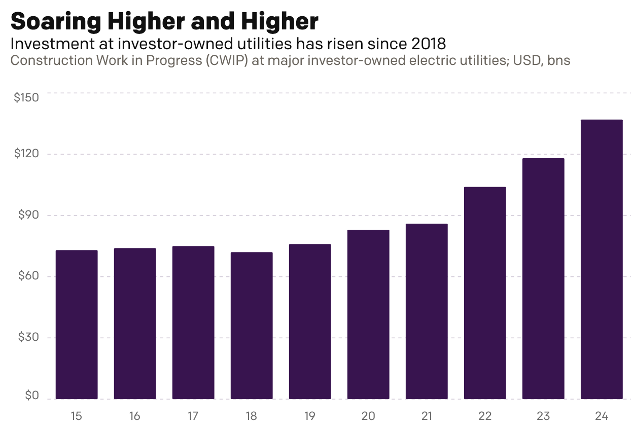
This past weekend I read an article over on Reuters about the cost of electricity for Americans, especially as it pertains to unfinished electrical generation projects. To be fair, I did not read it thinking I would be getting an opportunity to talk about something here on Coffeespoons. Rather, I just received a letter from…
-
Back to Boston’s Beginning
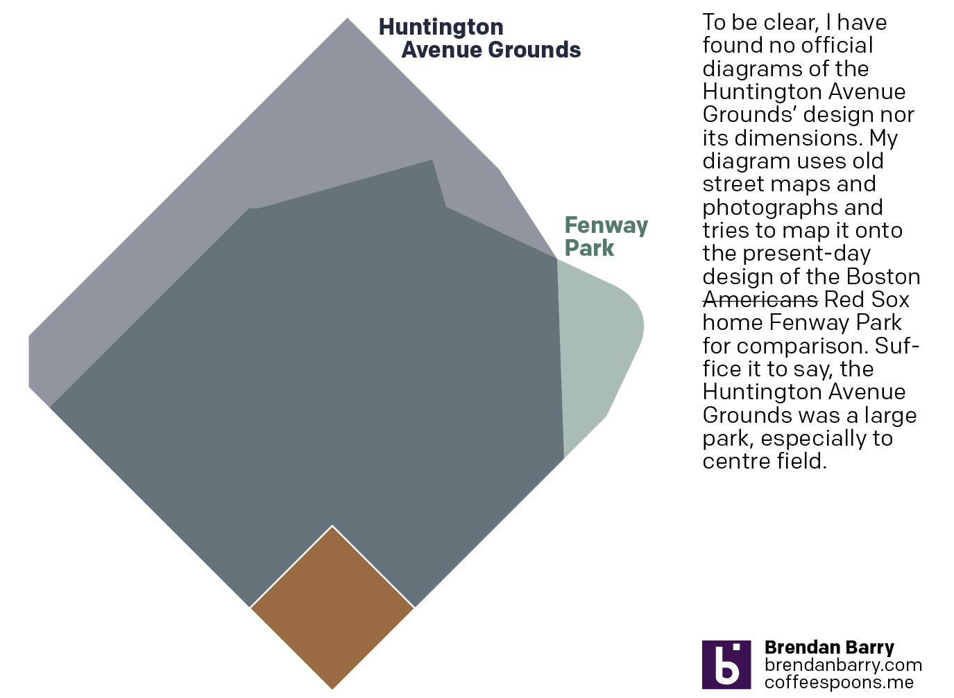
And I don’t mean the city’s. No, 125 years ago today, the Boston Americans, later to be renamed the Boston Red Sox, played their first home game. Not at Fenway Park, mind you, but their original home—the Huntington Avenue Grounds. I decided to make a graphic comparing Huntington Avenue to Fenway, but could not find…
-
The Broad Street Run
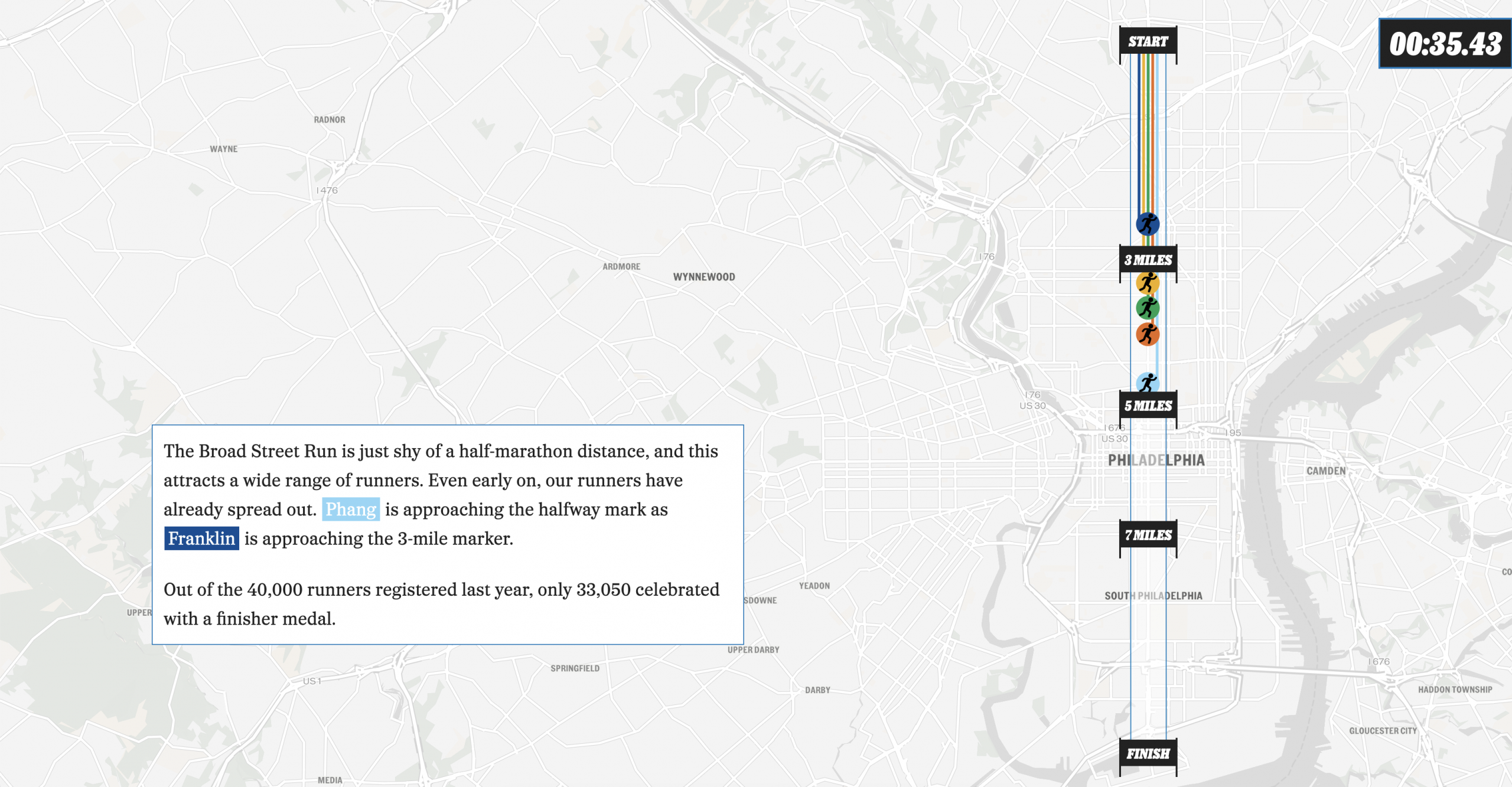
This past weekend, Philadelphia hosted the Broad Street Run, a 10-mile run from the “top” of the city’s Broad Street in the north to the end at the bottom in the Navy Yard, a length of—you guessed it—10 miles. And congratulations to my sister for not just running it for the first time, but completing…
-
Damon the Bad
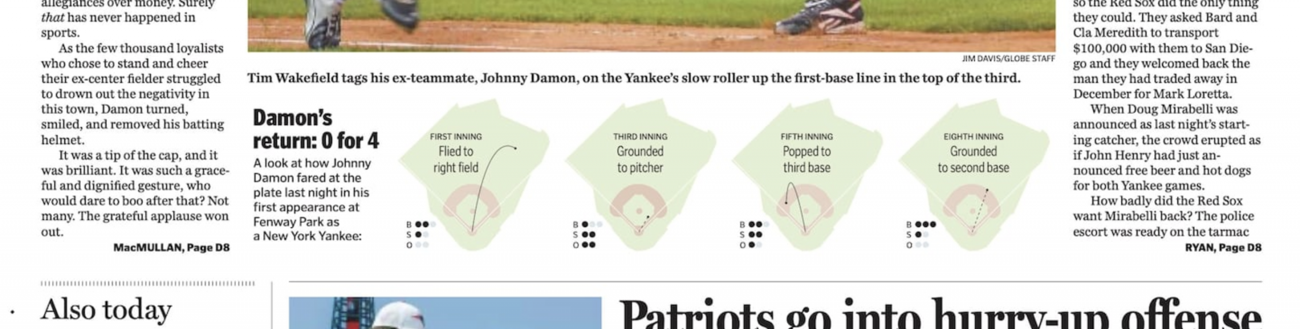
I guess we’re going to stick with the baseball this week. I forgot this year is the 20th anniversary of the Doug Mirabelli game. For those unfamiliar with the story, the Red Sox long employed knuckleballer Tim Wakefield, one of my all-time favourite pitchers. The knuckleball, however, is very difficult to catch because its lack…
-

AC to Philly Expressway?
And I am not talking about Atlantic City. No, on Saturday, the Red Sox fired their manager Alex Cora and his entire staff. Or, rather, the staff loyal to him. I wrote about that on Monday. Little did we know that Saturday night, Alex Cora and the chief of baseball operations for the Philadelphia Phillies,…
-
Revenge of the Nerds
This past weekend I thought I would be writing about something else, and perhaps I still will later this week, but for now we turn to the Boston Red Sox firing Alex Cora, their manager; Jason Varitek, beloved Sox icon and in the dugout as game planning and run prevention coach; Ramon Vazquez, bench coach;…
-

Peeps People in Pennsylvania
As many long-time readers know, my Carpatho–Rusyn origins means my family observes Orthodox Easter, which usually does not coincide with what I call Catholic Easter—because the other part of my background is Irish Catholic, so growing up there were two Easters. Now we just observe the one and so later today I am headed back…
-
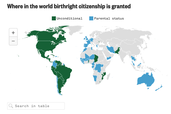
Born in the U.S.A.
Last Wednesday, when I was more focused on the Artemis II launch, the Supreme Court held oral arguments about the administration’s attempt to end birthright citizenship and overturn the 14th Amendment to the United States’ constitution. Kind of a big deal. NBC News ran a live blog covering the arguments and included an interactive map…
-
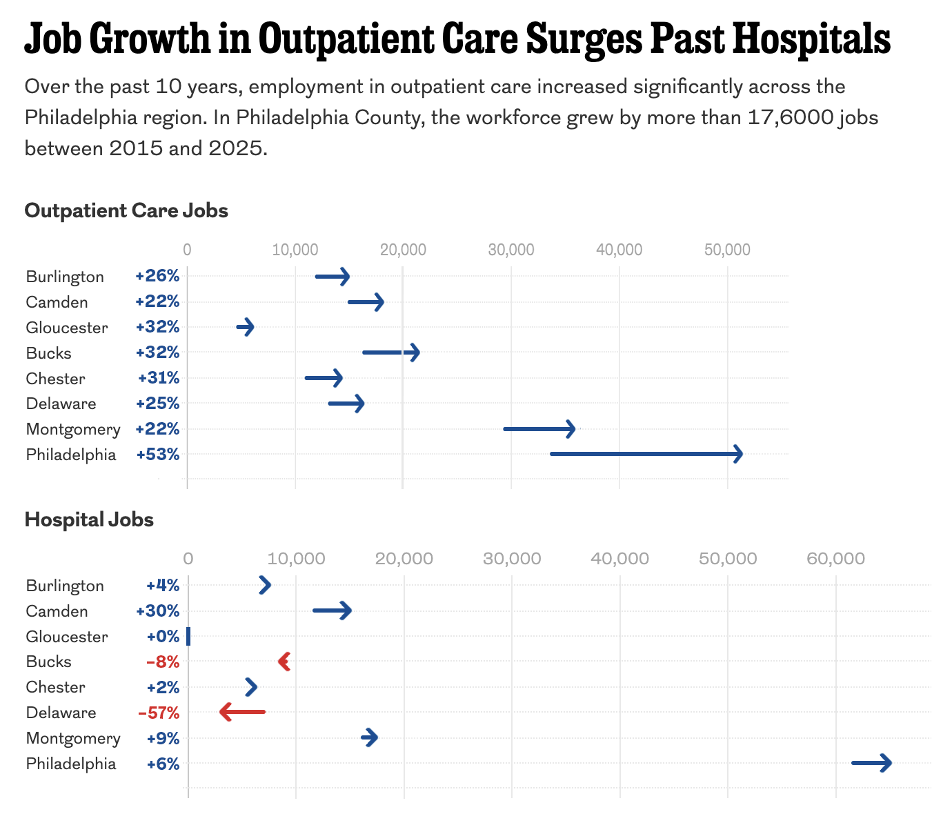
The Arrow Is Pointing Sideways
I was reading an article in my local rag, the Philadelphia Inquirer, when I came upon an article about the healthcare industry’s outsized role in the region’s job growth. The article led off with a staff illustration of medical-looking types on a graphic swirl background—nothing inherently wrong with that. The Inquirer would know best what…
-
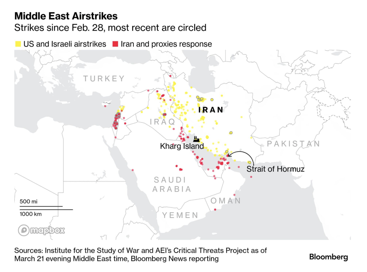
Gooood Morning, Bomb Iran?
As I ate breakfast this morning, I read through the Morning Briefing I receive from Bloomberg. These days, it provides a good update of what happened in Iran and the Middle East. Every once in a while I will flag one of their graphics to share here, but never decide to ultimately do it because…