Tag: charting
-
The Shrinking Colorado River
Last week the Washington Post published a nice long-form article about the troubles facing the Colorado River in the American and Mexican west. The Colorado is the river dammed by the Hoover and Glen Canyon Dams. It’s what flows through the Grand Canyon and provides water to the thirsty residents of the desert southwest. But…
-
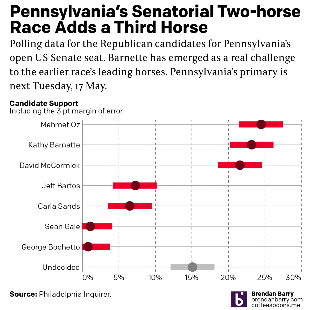
Political Hatch Jobs
Earlier this week I read an article in the Philadelphia Inquirer about the political prospects of some of the candidates for the open US Senate seat for Pennsylvania, for which I and many others will be voting come November. But before I get to vote on a candidate, members of the political parties first get…
-
Where’s My (State) Stimulus?
Here’s an interesting post from FiveThirtyEight. The article explores where different states have spent their pandemic relief funding from the federal government. The nearly $2 trillion dollar relief included a $350 billion block grant given to the states, to do with as they saw fit. After all, every state has different needs and priorities. Huzzah…
-
How Accurate Is Punxsutawney Phil?
For those unfamiliar with Groundhog Day—the event, not the film, because as it happens your author has never seen the film—since 1887 in the town of Punxsutawney, Pennsylvania (60 miles east-northeast of Pittsburgh) a groundhog named Phil has risen from his slumber, climbed out of his burrow, and went to see if he could see…